
Client: 3D Photoworks / 2020
Client: 3D Photoworks / 2020
Client: 3D Photoworks / 2020
Client: 3D Photoworks / 2020
Client: 3D Photoworks / 2020
Tactile Images
Tactile Images
Tactile Images
Tactile Images
Tactile Images
ROLE: Branding, Content strategy, Creative Direction, UX/UI
ROLE: Branding, Content strategy, Creative Direction, UX/UI
ROLE: Branding, Content strategy, Creative Direction, UX/UI
ROLE: Branding, Content strategy, Creative Direction, UX/UI
At its core Tactile Images’ mission is to bring art and photography closer to the blind and visually impaired through 3D printed images.
These images are developed as interactive installations that include braille, sensor activated audio, and even components capable of emitting unique smells.
Thanks to them the blind community has been able to experience artwork and imagery in a personal way in many cases for the first time.
OBJECTIVE
Tactile Images is born out of the partnership between Getty images, the National Federation of the Blind, and 3D Photoworks. Thanks to this collaboration, Tactile Images is able to make over 45 million images accessible to the blind and disabled at museums, science centers, libraries, government agencies, and cultural institutions worldwide.
For its launch in early 2021 Tactile Images needed a visual identity and a scalable design system for both digital and printed materials.
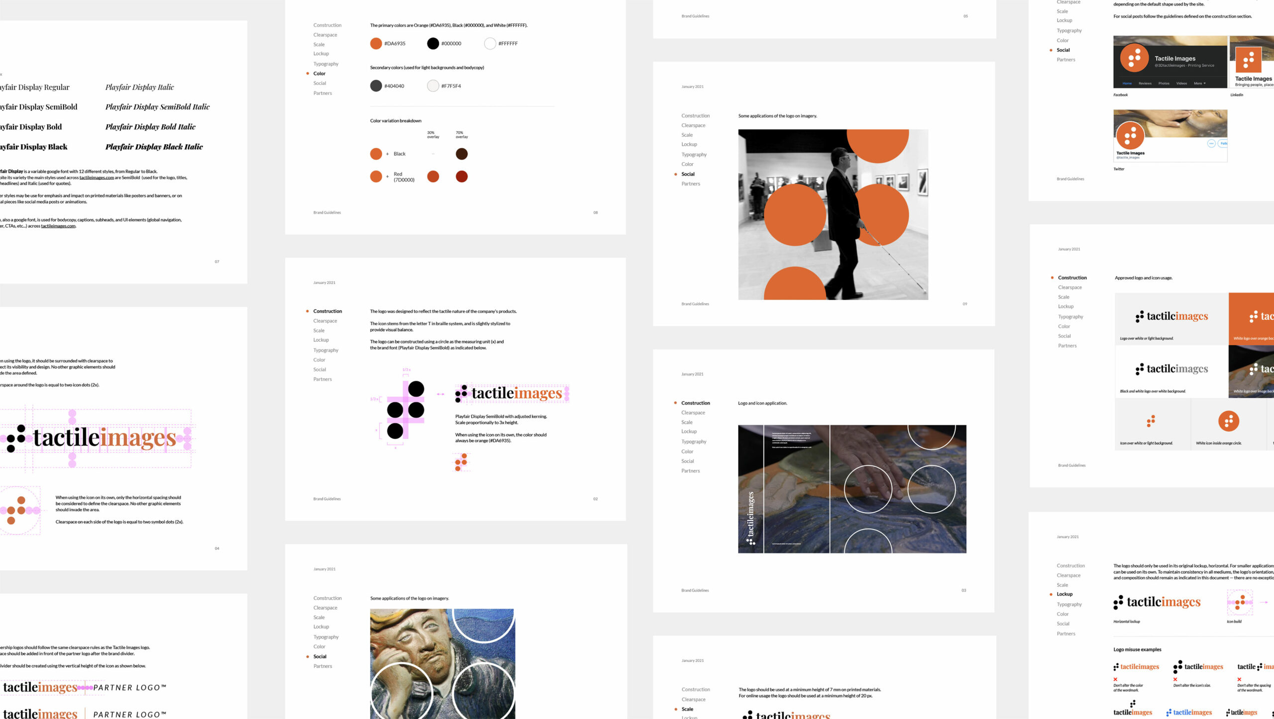
The wordmark and symbol needed to reflect the tactile nature of their products as well as the educational aspect of the company’s mission.
Tactile Images is born out of the partnership between Getty images, the National Federation of the Blind, and 3D Photoworks. Thanks to this collaboration, Tactile Images is able to make over 45 million images accessible to the blind and disabled at museums, science centers, libraries, government agencies, and cultural institutions worldwide.
For its launch in early 2021 Tactile Images needed a visual identity and a scalable design system for both digital and printed materials.
The wordmark and symbol needed to reflect the tactile nature of their products as well as the educational aspect of the company’s mission.
LOGO
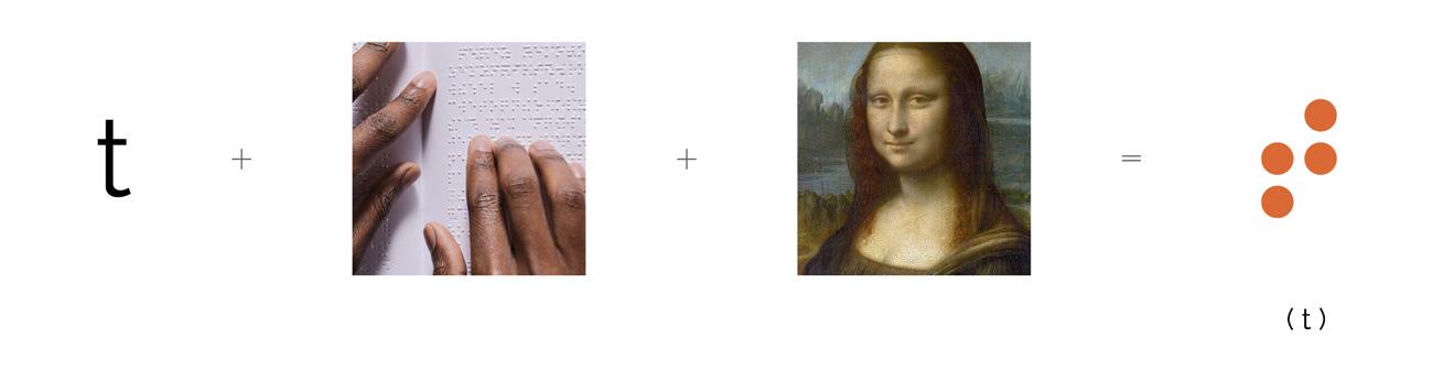
The solution is inspired by kinesthetic learning. Even though other senses can be triggered by the interactive installations, touch is the dominant one and it creates a personal connection between the individual and the content.
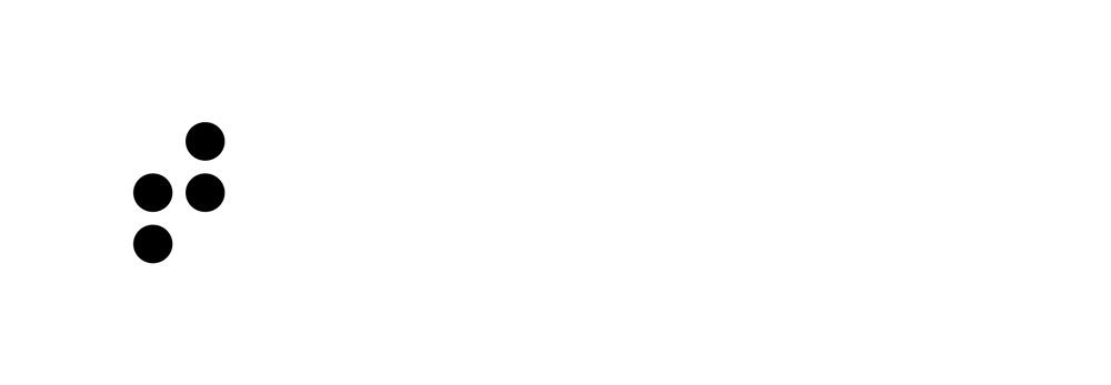
The symbol stems from the letter “t” in braille system, and is slightly stylized to provide visual balance; it can be quickly recreated following the grid provided.
The solution is inspired by kinesthetic learning. Even though other senses can be triggered by the interactive installations, touch is the dominant one and it creates a personal connection between the individual and the content.
The symbol stems from the letter “t” in braille system, and is slightly stylized to provide visual balance; it can be quickly recreated following the grid provided.
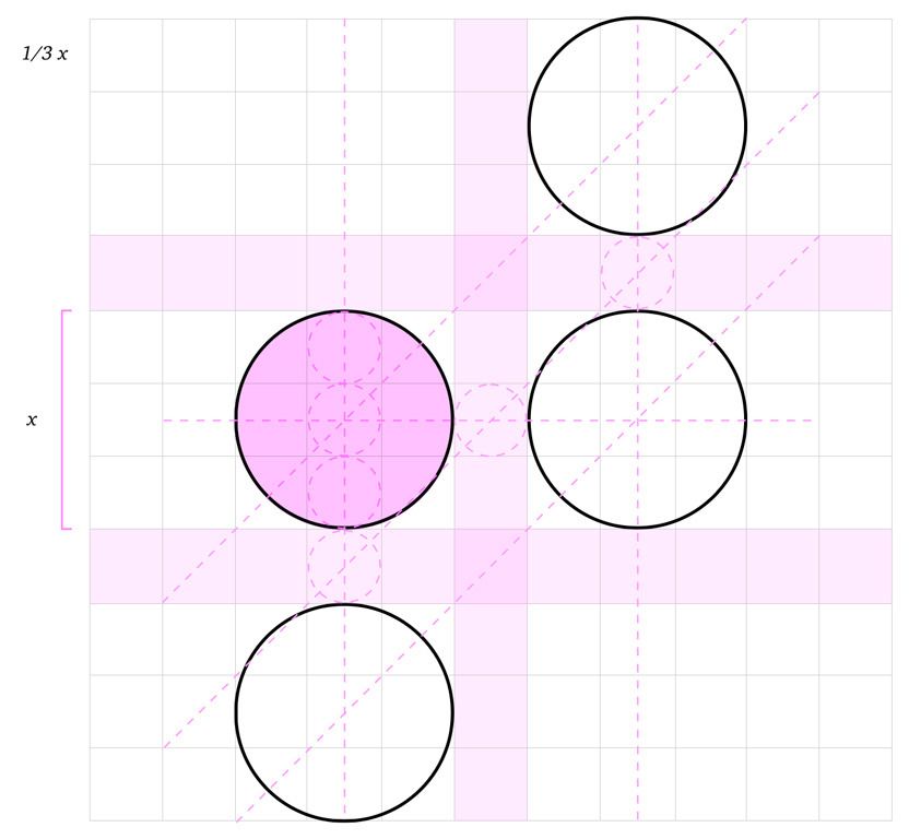
The wordmark uses Playfair Display SemiBold with adjusted kerning, and its proportion in relation to the symbol is three times the diameter of one of the symbol’s dots.
The typography chosen represents the brand’s educational and traditional values complementing the geometry of the symbol.
The wordmark uses Playfair Display SemiBold with adjusted kerning, and its proportion in relation to the symbol is three times the diameter of one of the symbol’s dots.
The typography chosen represents the brand’s educational and traditional values complementing the geometry of the symbol.
COLOR
COLOR
For the primary color we chose a shade of orange that transmits encouragement, creativity, and joy but also reflects the confidence and professional know-how of the brand.
Black and White complete the primary color selection and are used depending on the background the logo is displayed on.
The secandary colors are created by overlaying a percentage of red or black to the primary orance hue.
Orange
Pantone 7578 C
C10 M71 Y90 K1
#DA6935
Orange
Pantone 7578 C
C10 M71 Y90 K1
#DA6935
Orange
Pantone 7578 C
C10 M71 Y90 K1
#DA6935
Orange
Pantone 7578 C
C10 M71 Y90 K1
#DA6935
Orange
Pantone 7578 C
C10 M71 Y90 K1
#DA6935
Black
Pantone Black 6C
C75 M68 Y67 K90
#000000
Black
Pantone Black 6C
C75 M68 Y67 K90
#000000
Black
Pantone Black 6C
C75 M68 Y67 K90
#000000
Black
Pantone Black 6C
C75 M68 Y67 K90
#000000
Black
Pantone Black 6C
C75 M68 Y67 K90
#000000
White
C0 M0 Y0 K0
#FFFFFF
White
C0 M0 Y0 K0
#FFFFFF
White
C0 M0 Y0 K0
#FFFFFF
White
C0 M0 Y0 K0
#FFFFFF
White
C0 M0 Y0 K0
#FFFFFF
Medium Orange
Pantone 7598 C
C18 M84 Y100 K8
#BE4925
Medium Orange
Pantone 7598 C
C18 M84 Y100 K8
#BE4925
Medium Orange
Pantone 7598 C
C18 M84 Y100 K8
#BE4925
Medium Orange
Pantone
7598 C
C18 M84 Y100 K8
#BE4925
Medium Orange
Pantone 7598 C
C18 M84 Y100 K8
#BE4925
Dark Orange
Pantone 484 C
C26 M98 Y100 K24
#981F0F
Dark Orange
Pantone 484 C
C26 M98 Y100 K24
#981F0F
Dark Orange
Pantone 484 C
C26 M98 Y100 K24
#981F0F
Dark Orange
Pantone 484 C
C26 M98 Y100 K24
#981F0F
Dark Orange
Pantone 484 C
C26 M98 Y100 K24
#981F0F
Brown
Pantone 4625 C
C48 M75 Y81 K69
#401F0F
Brown
Pantone 4625 C
C48 M75 Y81 K69
#401F0F
Brown
Pantone 4625 C
C48 M75 Y81 K69
#401F0F
Brown
Pantone 4625 C
C48 M75 Y81 K69
#401F0F
Brown
Pantone 4625 C
C48 M75 Y81 K69
#401F0F
TYPOGRAPHY
TYPOGRAPHY
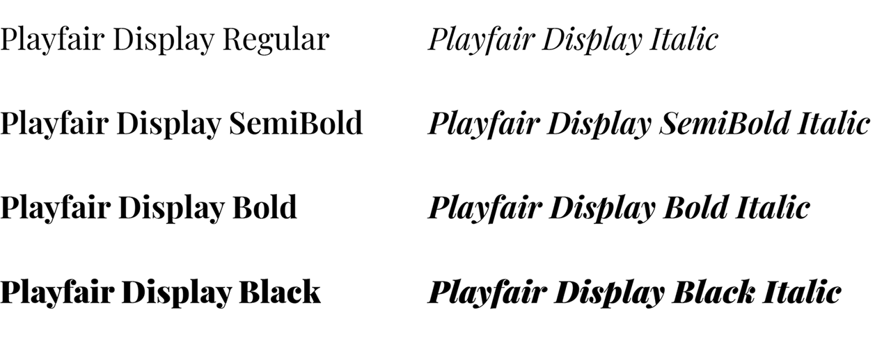
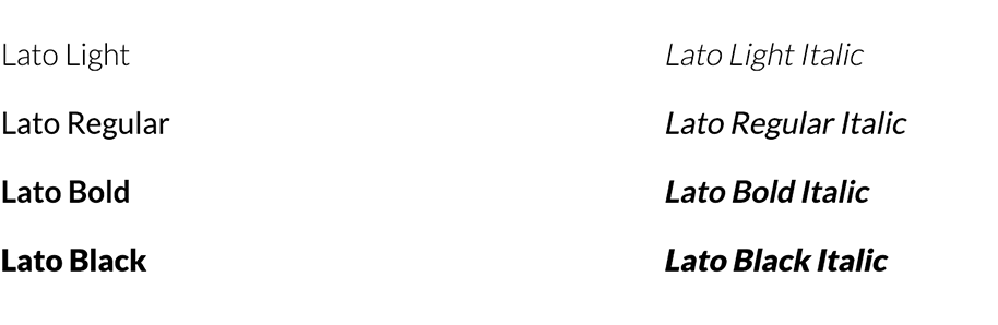
Playfair Display is a variable google font with 12 different styles, from Regular to Black. Despite its variety the main styles used across tactileimages.com are SemiBold (used for the logo, titles, and headlines) and Italic (used for quotes).
Other styles may be use for emphasis on printed materials like posters and banners, or on digital pieces like social media posts or animations.
Lato, also a google font, is used for bodycopy, captions, subheads, and UI elements (global navigation, footer, CTAs, etc...) across tactileimages.com.
Lato, also a google font, is used for bodycopy, captions, subheads, and UI tokens across the site.
Lato, also a google font, is used for bodycopy, captions, subheads, and UI tokens across the site.
Lato, also a google font, is used for bodycopy, captions, subheads, and UI tokens across the site.
Lato, also a google font, is used for bodycopy, captions, subheads, and UI tokens across the site.
BRAND GUIDELINES
WEBSITE
The development team was engaged early on to start laying the ground work to integrate Gettyimages’ APIs. The data used on the backend would ultimately define the content architechture for the image search section and its interaction patterns.
The development team was engaged early on to start laying the ground work to integrate Gettyimages’ APIs. The data used on the backend would ultimately define the content architechture for the image search section and its interaction patterns.
The development team was engaged early on to start laying the ground work to integrate Gettyimages’ APIs. The data used on the backend would ultimately define the content architechture for the image search section and its interaction patterns.
The development team was engaged early on to start laying the ground work to integrate Gettyimages’ APIs. The data used on the backend would ultimately define the content architechture for the image search section and its interaction patterns.
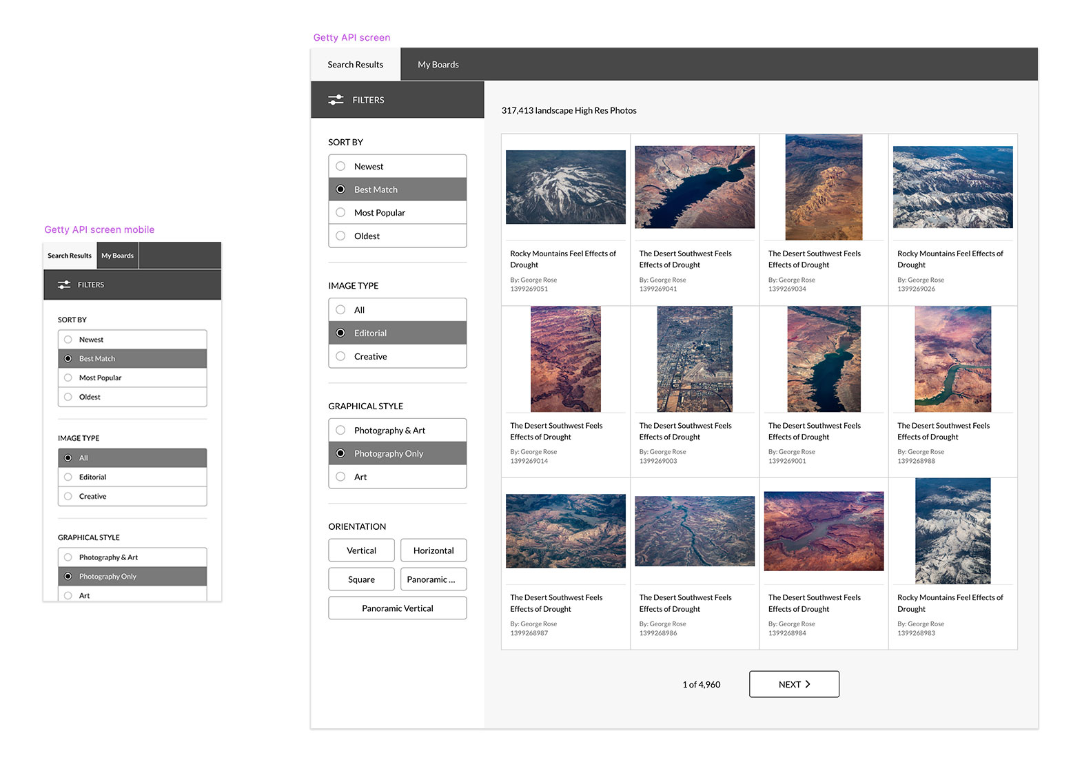
Once wireframes and low fidelity prototypes were approved we created a flexible design system based on customizable components to give the client the freedom to create new pages and modify existing ones though a CMS without the need for a dedicated dev team.
Once wireframes and low fidelity prototypes were approved we created a flexible design system based on customizable components to give the client the freedom to create new pages and modify existing ones though a CMS without the need for a dedicated dev team.
Once wireframes and low fidelity prototypes were approved we created a flexible design system based on customizable components to give the client the freedom to create new pages and modify existing ones though a CMS without the need for a dedicated dev team.
Once wireframes and low fidelity prototypes were approved we created a flexible design system based on customizable components to give the client the freedom to create new pages and modify existing ones though a CMS without the need for a dedicated dev team.
Once wireframes and low fidelity prototypes were approved we created a flexible design system based on customizable components to give the client the freedom to create new pages and modify existing ones though a CMS without the need for a dedicated dev team.

ADDITIONAL MATERIALS
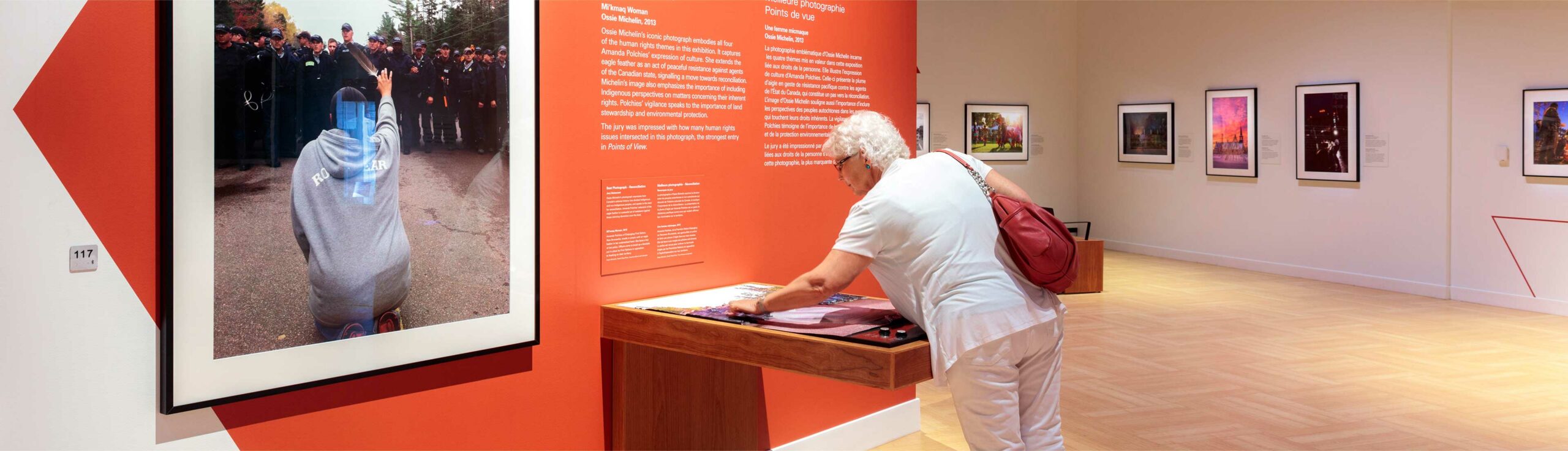
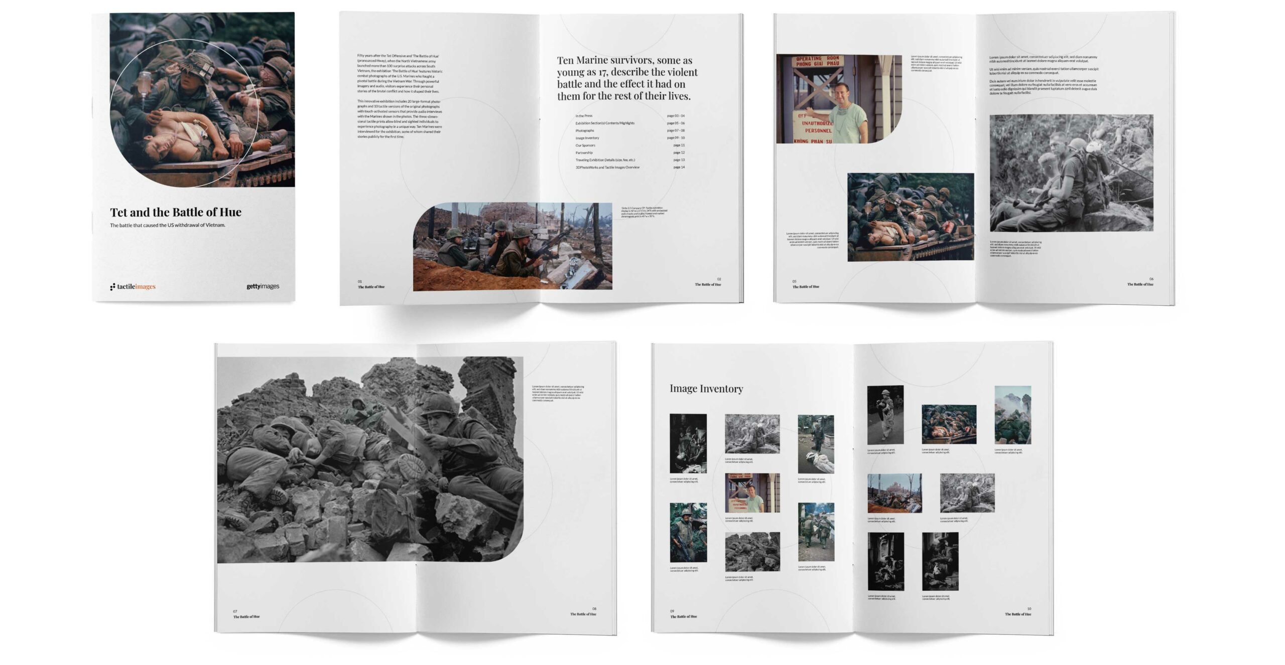
Travelling exhibitions are curated collections of both tactile displays and hi-res prints that travel to museums and educational institutions throughout the world.
To promote these exhibits we were asked to design a brochure that would allow the client to edit and create new brochures as needed. Using the brand guidelines as the starting point we expanded on the design system to create a flexible easy to use template.
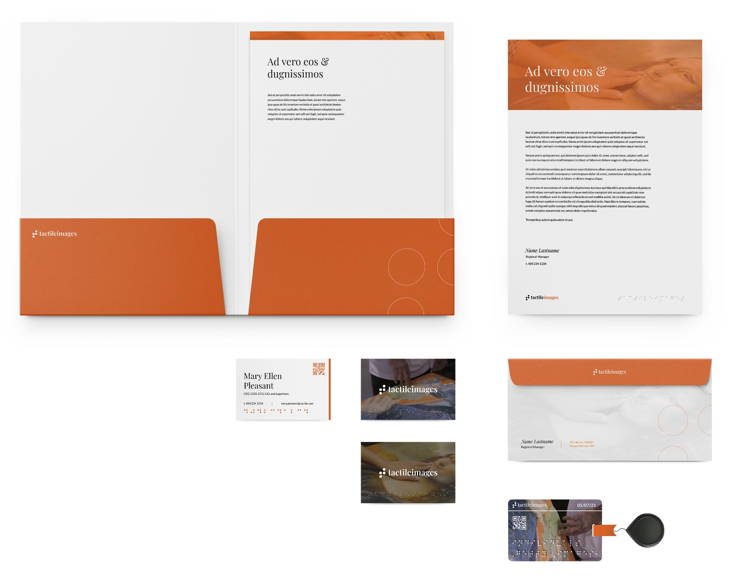
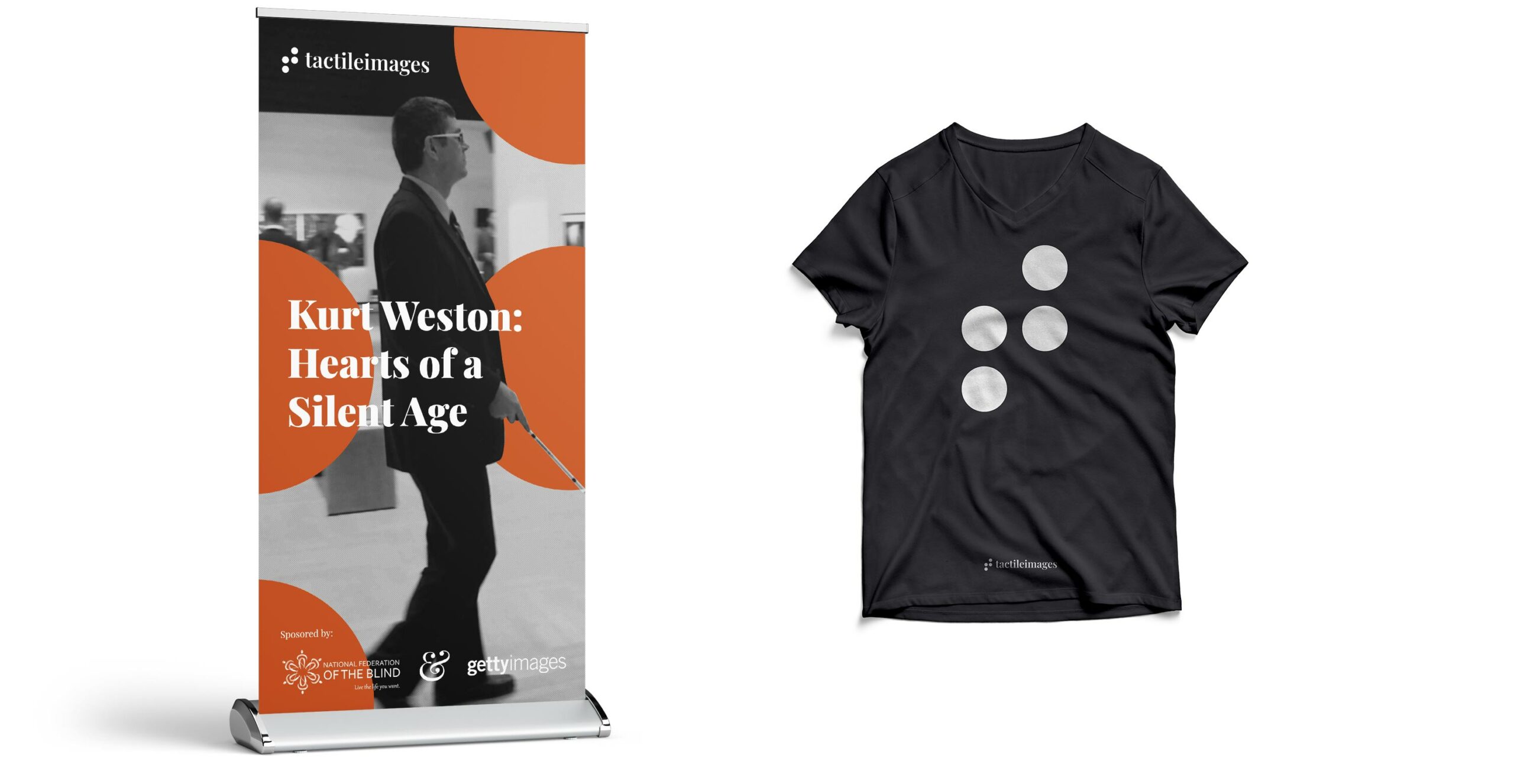
The following mockups were created to explore the aplication of the brand identity to different formats and materials but have not been developed yet.
The following mockups were created to explore the aplication of the brand identity to different formats and materials but have not been developed yet.
The following mockups were created to explore the aplication of the brand identity to different formats and materials but have not been developed yet.
The following mockups were created to explore the aplication of the brand identity to different formats and materials but have not been developed yet.
Thank you!