
Client: ADP / 2018 - 2019
Client: ADP / 2018 - 2019
Client: ADP / 2018 - 2019
Client: ADP / 2018 - 2019
Client: ADP / 2018 - 2019
Always designing for people
Always
designing
for people
Always designing for people
Always designing
for people
Always designing for people
ROLE: Creative direction, Branding, UX/UI
ROLE: Creative direction, Branding, UX/UI
ROLE: Creative direction, Branding, UX/UI
ROLE: Creative direction, Branding, UX/UI
ROLE: Creative direction, Branding, UX/UI
1 in 6 Americans get their paycheck through ADP. However despite their ubiquity & reach ADP was virtually invisible.
70 after its inception it was time to let the world know they are more than just a payroll company.
1 in 6 Americans get their paycheck through ADP. However despite their ubiquity & reach ADP was virtually invisible.
70 after its inception it was time to let the world know they are more than just a payroll company.
1 in 6 Americans get their paycheck through ADP. However despite their ubiquity & reach ADP was virtually invisible.
70 after its inception it was time to let the world know they are more than just a payroll company.
1 in 6 Americans get their paycheck through ADP. However despite their ubiquity & reach ADP was virtually invisible.
70 after its inception it was time to let the world know they are more than just a payroll company.
1 in 6 Americans get their paycheck through ADP. However despite their ubiquity & reach ADP was virtually invisible.
70 after its inception it was time to let the world know they are more than just a payroll company.
THE BRAND
Automatic Data Processing began in 1949 as Automatic Payrolls, Inc. In 1958, Henry Taub, Joe Taub, and Frank Lautenberg merged their two companies, Automatic Payrolls and Automatic Tabulating and named the new company “Automatic Data Processing.”
While the brand has barely changed throughout the decades, their business definitely has. As a company devoted to people and technology, ADP’s approach to innovation doesn’t end at products and services; it also extends to their delivery methods for clients. This needed to be at the center of our rebranding efforts.
Taking a legacy brand
and transforming it for the future.

We landed on a powerful new positioning, “ADP: Always Designing for People.”
This turn of phrase helped catalyze our efforts to modernize the brand—by focusing on the achievements and improvements made for the sake of the end user.
We landed on a powerful new positioning, “ADP: Always Designing for People.”
This turn of phrase helped catalyze our efforts to modernize the brand—by focusing on the achievements and improvements made for the sake of the end user.
We landed on a powerful new positioning, “ADP: Always Designing for People.”
This turn of phrase helped catalyze our efforts to modernize the brand—by focusing on the achievements and improvements made for the sake of the end user.
We landed on a powerful new positioning, “ADP: Always Designing for People.”
This turn of phrase helped catalyze our efforts to modernize the brand—by focusing on the achievements and improvements made for the sake of the end user.
We landed on a powerful new positioning, “ADP: Always Designing for People.”
This turn of phrase helped catalyze our efforts to modernize the brand—by focusing on the achievements and improvements made for the sake of the end user.
IN WITH THE NEW
IN WITH THE NEW
ADP's new progressive brand identity pays homage to its past, while evoking the data and insights in its products and services.
The identity consists of a refined color palette, fluid grid structure, data-driven visualizations and typography that infuses layout to iconography.
ADP's new progressive brand identity pays homage to its past, while evoking the data and insights in its products and services.
The identity consists of a refined color palette, fluid grid structure, data-driven visualizations and typography that infuses layout to iconography.

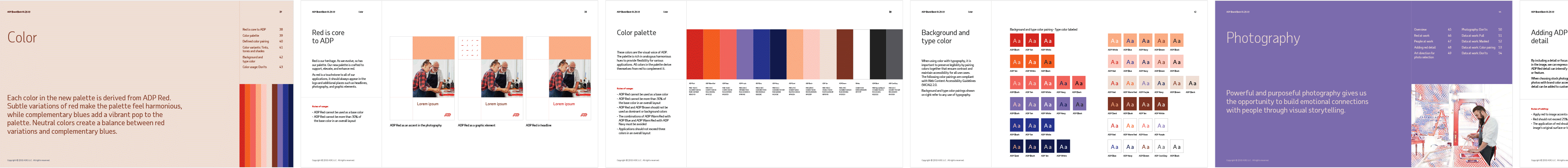
The brand palette is the visual voice of ADP, and all of its colors derive themselves from red to complement it.
The brand palette is the visual voice of ADP, and all of its colors derive themselves from red to complement it.


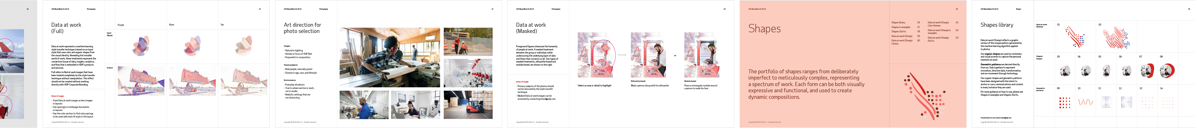
Data at work is a machine learning style transfer technique trained on an input style that uses color and organic shapes from the visual identity. Revealing the invisible world of work, these treatments show the connective tissue of data, insights, analytics, and flow that is embodied in ADP’s products and services.

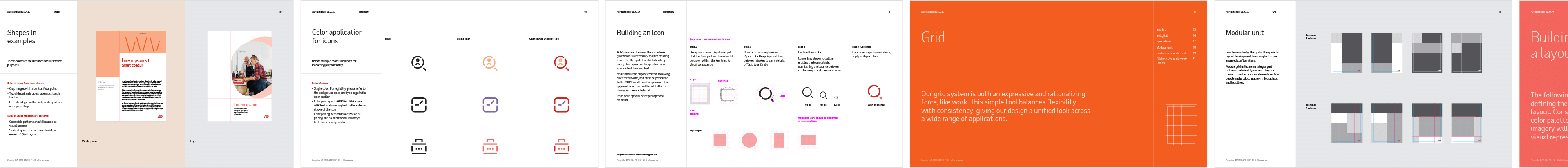
Data at work (Stamp) reflects a graphic version of the unique pattern generated by the machine learning algorithm applied to photos.
The "data stamp" reflects a graphic version of the unique pattern generated by the machine learning algorithm applied to photos.
TYPE
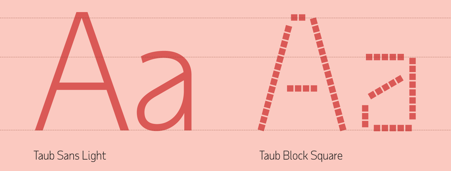
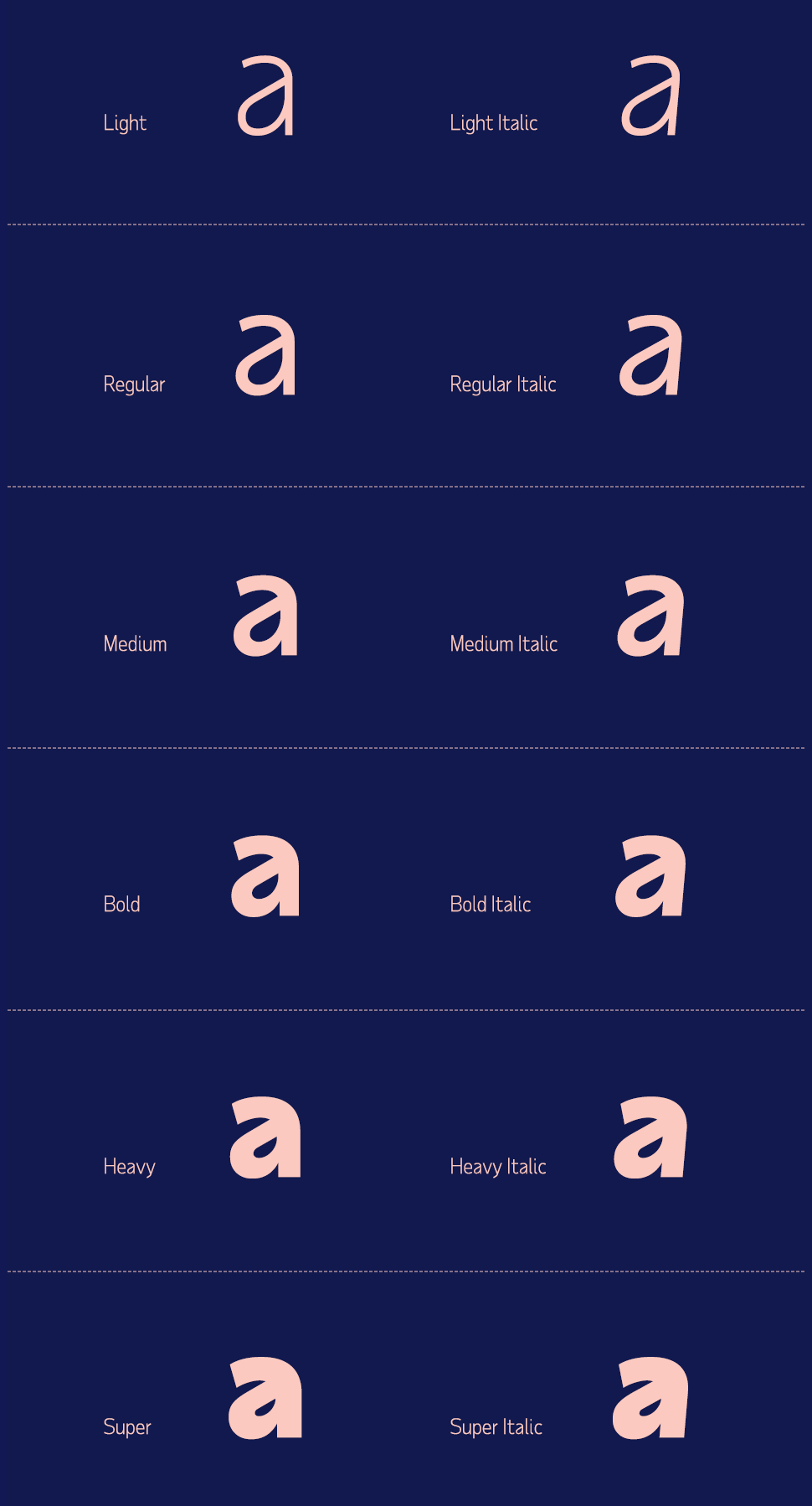
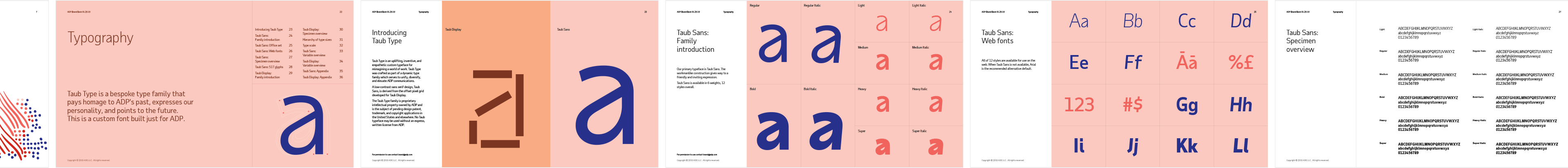
We created Taub Type, named after the company’s founder, Henry Taub. Taub Type is a patented variable type system that is dynamic, reactive and responsive in real-time.
Taub Type is a classically proportioned, low contrast sans-serif meets offset pixel grid. The Taub Type variable type system is now the recipient of 5 design patents.


BRAND ROLLOUT
The rollout and activation strategy for the new brand consisted of two phases; manifesto and launch campaign. Each was supported by online and printed materials as well as guerrilla campaigns at SXSW, and complete takeovers of New York’s Westfield World Trade Center and San Francico’s Montgomery station.
The solution is inspired by kinesthetic learning. Even though other senses can be triggered by the interactive installations, touch is the dominant one and it creates a personal connection between the individual and the content.
The symbol stems from the letter “t” in braille system, and is slightly stylized to provide visual balance; it can be quickly recreated following the grid provided.
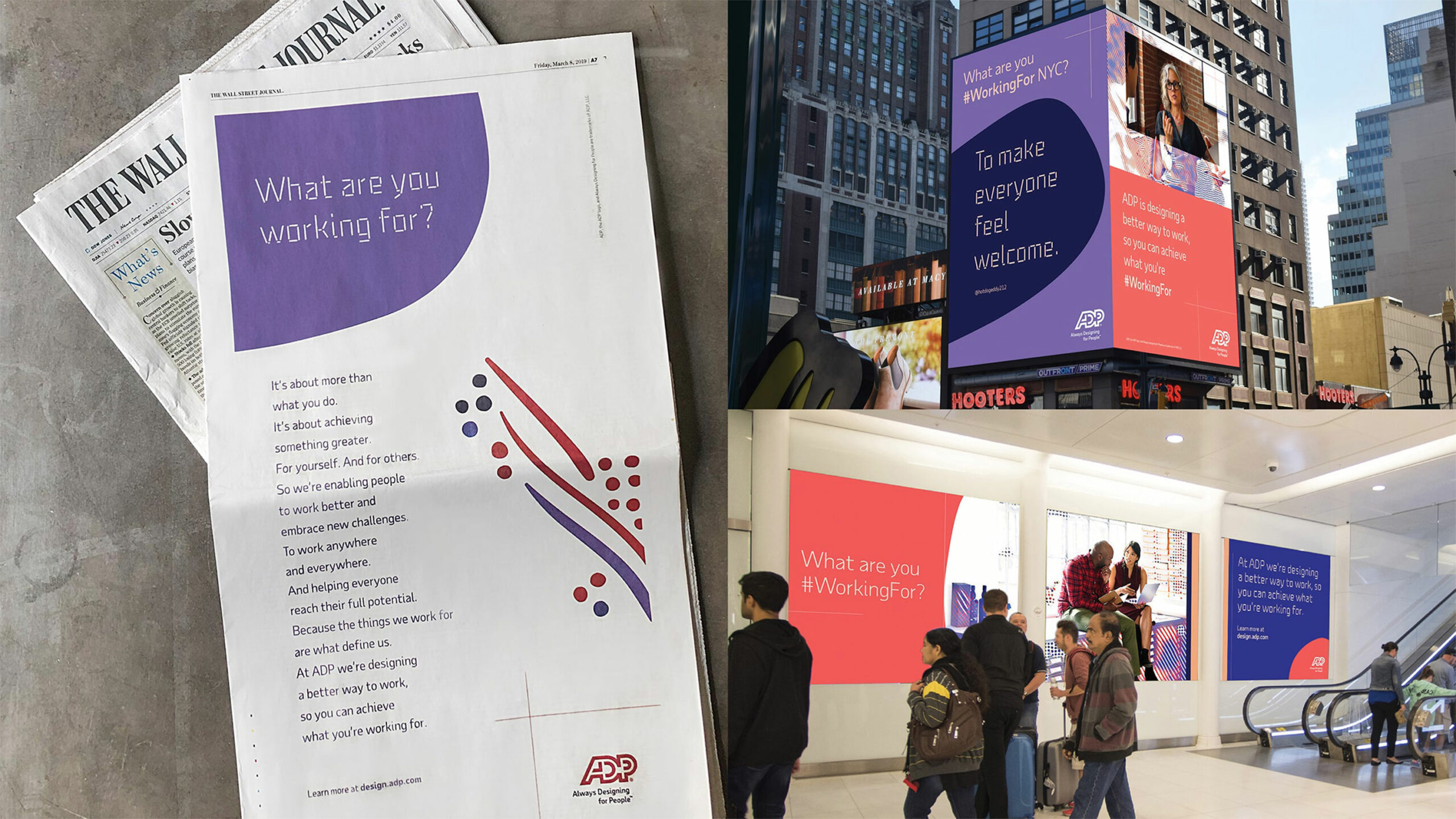
The Wall Street Journal manifesto one-pager, Penn Station digital billboards, Westfield World Trade Center digital billboards.
The Wall Street Journal manifesto one-pager, Penn Station digital billboards, Westfield World Trade Center digital billboards.
The Wall Street Journal manifesto one-pager, Penn Station digital billboards, Westfield World Trade Center digital billboards.
The Wall Street Journal manifesto one-pager, Penn Station digital billboards, Westfield World Trade Center digital billboards.
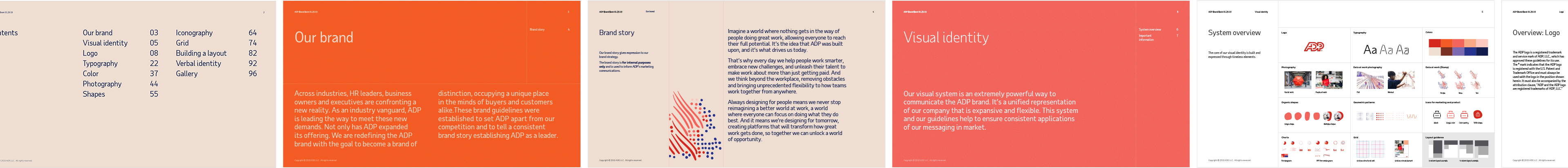
GUIDELINES
Thank you!