
Client: IBM / 2018
Client: IBM / 2018
Client: IBM / 2018
Client: IBM / 2018
Client: IBM / 2018
Interaction Models
Interaction Models
Interaction Models
Interaction Models
Interaction Models
ROLE: Project lead, User testing, UX/UI
ROLE: Project lead, User testing, UX/UI
ROLE: Project lead, User testing, UX/UI
ROLE: Project lead, User testing, UX/UI
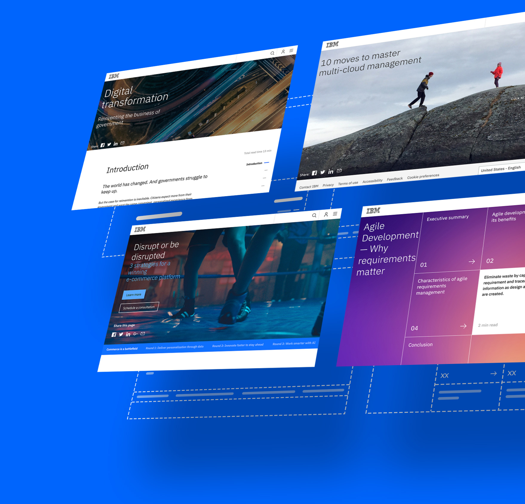
Business Units at IBM generate thousands of whitepapers every year. These are published as PDFs and stored away in heavily populated pages.
As a result, the search for specific topics across industries becomes a time-consuming and inefficient task.
The challenge was to identify design and interaction patterns that reimagined the whitepaper's content arquitecture and searchability.
APPROACH
APPROACH
We started by auditing existing whitepapers with a special focus on those with a wide variety of content types. This would allow us to create a scalable system with enough flexibility to accomodate for existing content needs, and easily adapt to future demands.
The work was divided in two main tracks:
Cataloging the content to thoroughly assess strengths/ weaknesses and opportunities for improvement.
Exploring different interaction models, ranging from traditional reading and interaction patterns to more experimental approaches.
We started by auditing existing whitepapers with a special focus on those with a wide variety of content types. This would allow us to create a scalable system with enough flexibility to accomodate for existing content needs, and easily adapt to future demands.
The work was divided in two main tracks:
Cataloging the content to thoroughly assess strengths/weaknesses and opportunities for improvement.
Exploring different interaction models, ranging from traditional reading and interaction patterns to more experimental approaches.
We started by auditing existing whitepapers with a special focus on those with a wide variety of content types. This would allow us to create a scalable system with enough flexibility to accomodate for existing content needs, and easily adapt to future demands.
The work was divided in two main tracks:
Cataloging the content to thoroughly assess strengths/ weaknesses and opportunities for improvement.
Exploring different interaction models, ranging from traditional reading and interaction patterns to more experimental approaches.
We started by auditing existing whitepapers with a special focus on those with a wide variety of content types. This would allow us to create a scalable system with enough flexibility to accomodate for existing content needs, and easily adapt to future demands.
The work was divided in two main tracks:
Cataloging the content to thoroughly assess strengths/ weaknesses and opportunities for improvement.
Exploring different interaction models, ranging from traditional reading and interaction patterns to more experimental approaches.
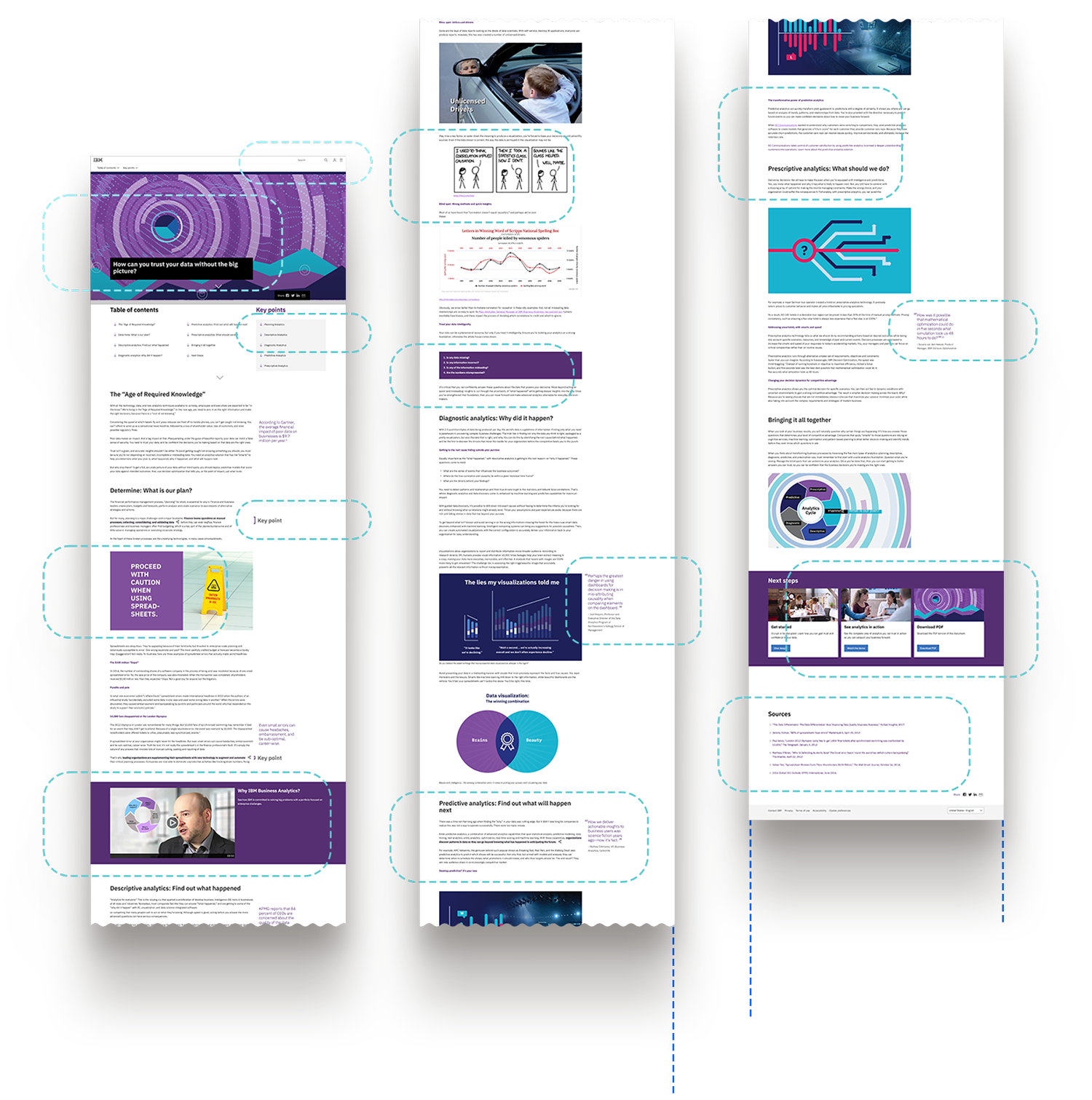
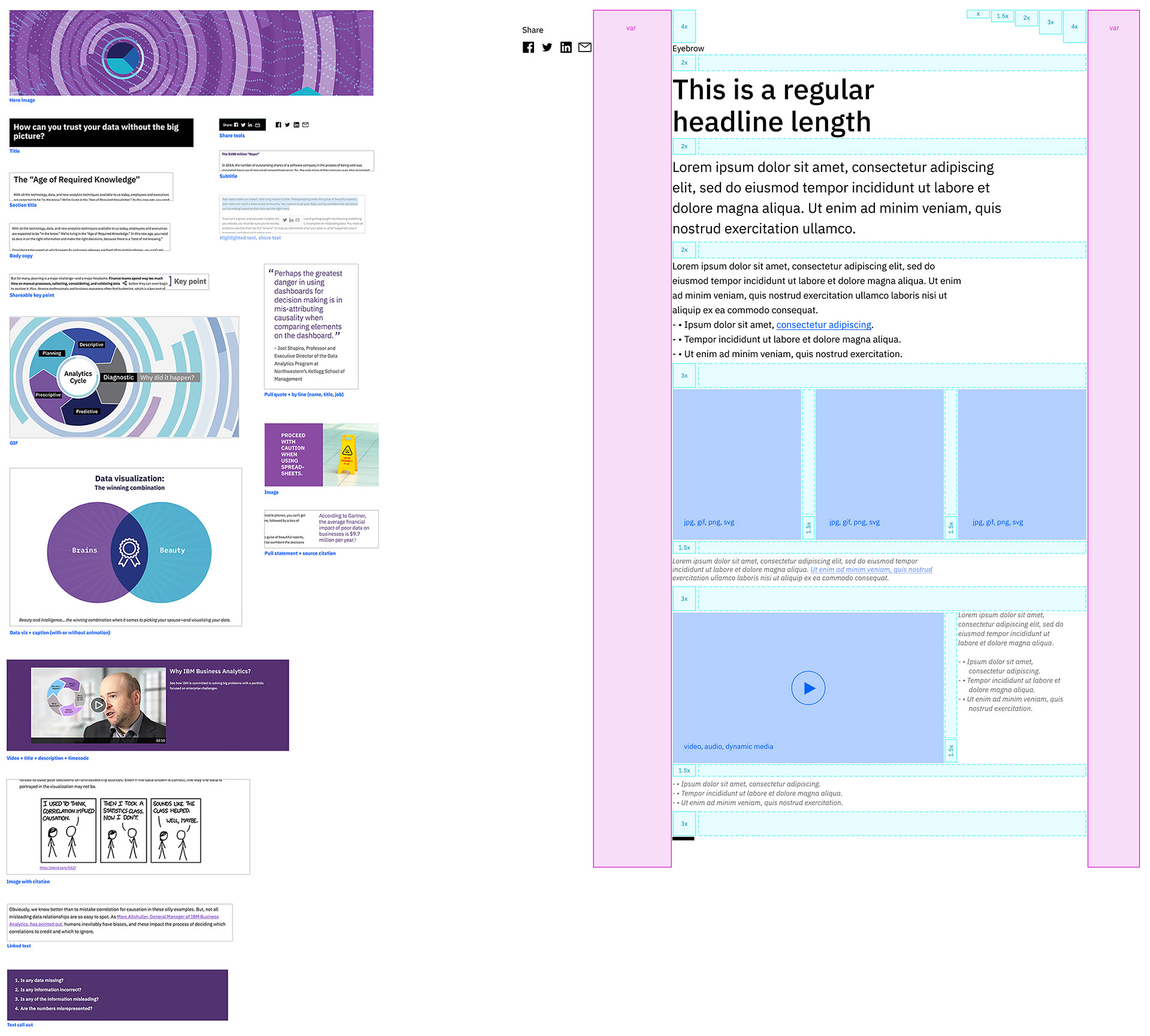
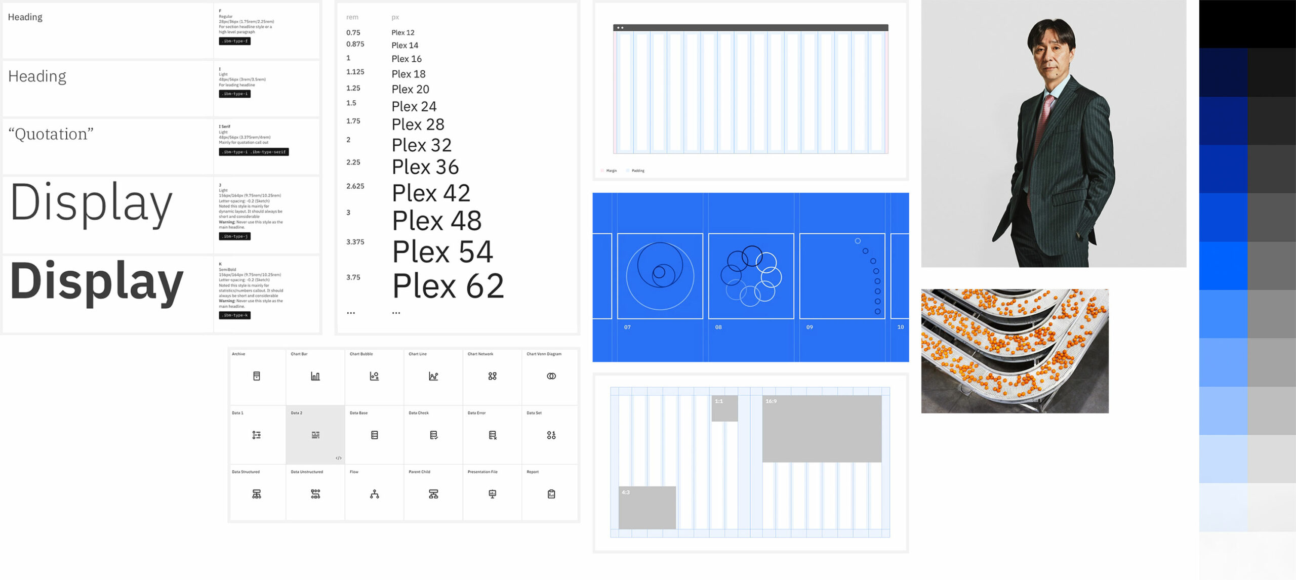
All the components were classified by complexity, interaction, and media type, and an preliminary master component was assembled. This master accounted for almost 80% of the content needs and gave the CMS editor full control over the styling of both written content and media assets.
The UX was informed by the building blocks provided by IBMs design system.
THE EXPERIENCE
THE EXPERIENCE
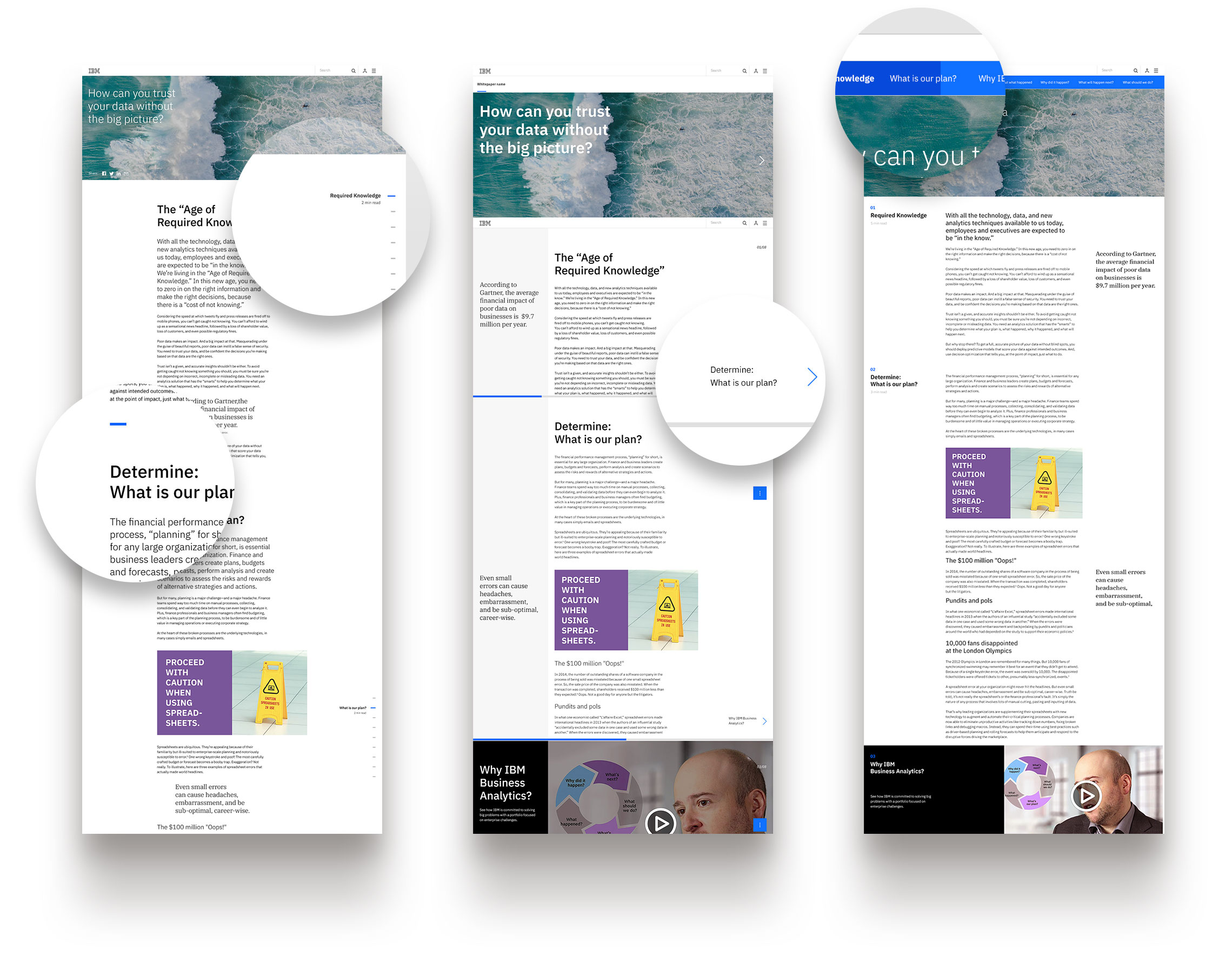
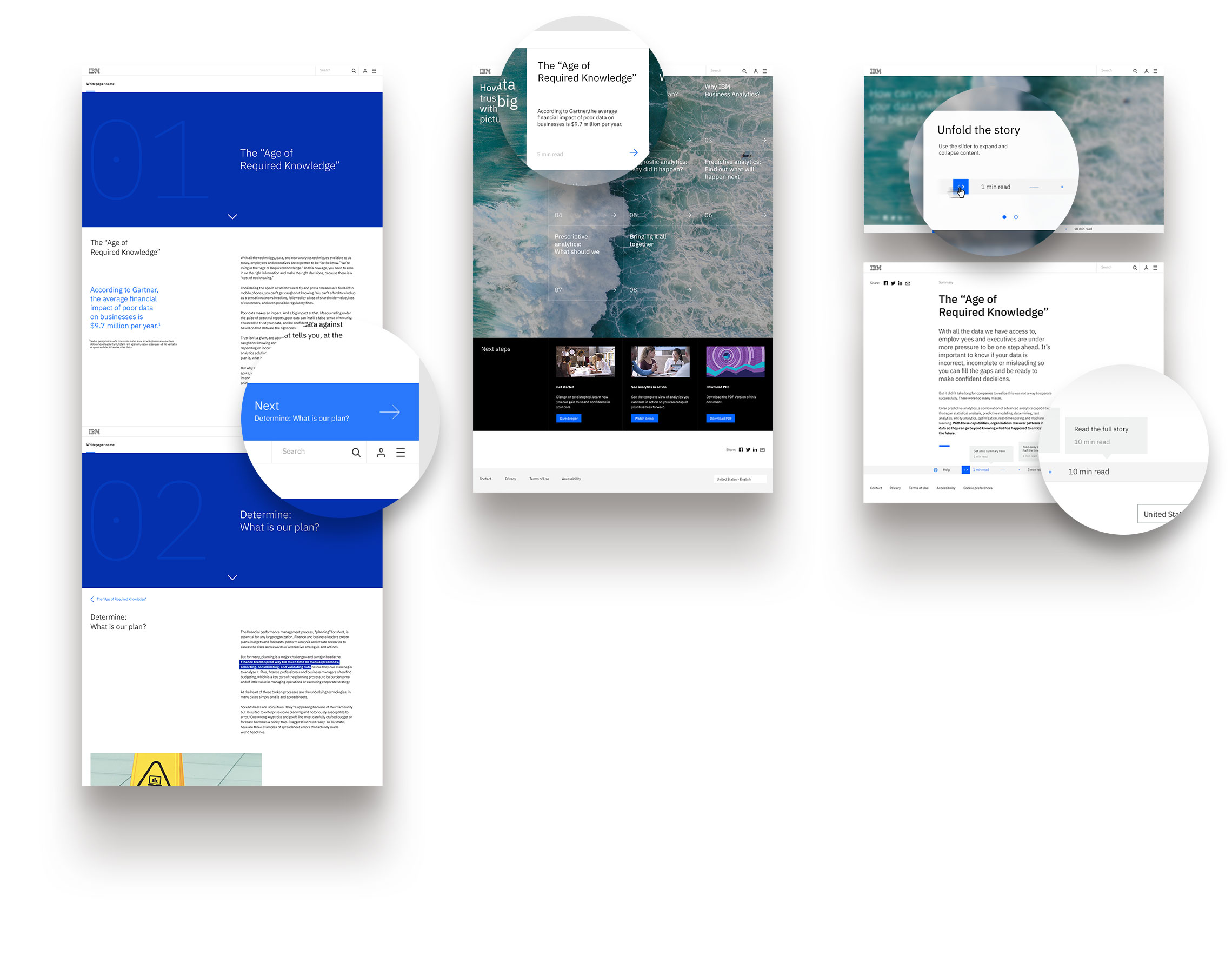
We identified a total of twelve interaction models covering a wide range of reading and interaction patterns.
Creating low fidelity prototypes for each model allowed us to get a closer look at the patterns and discard those experiences that didn’t meet the criteria for this project.
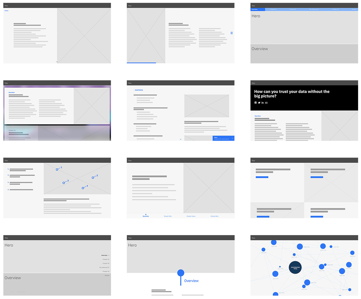
The next step was to fully integrate the redesigned content blocks and interaction models using IBMs design system. This presented a new opportunity to not only leverage IBMs design tokens but also expand on their interaction library.
DESIGN & INTERACTIONS
DESIGN & INTERACTIONS
Form follows function. Nothing is gratuitous or there for decoration.
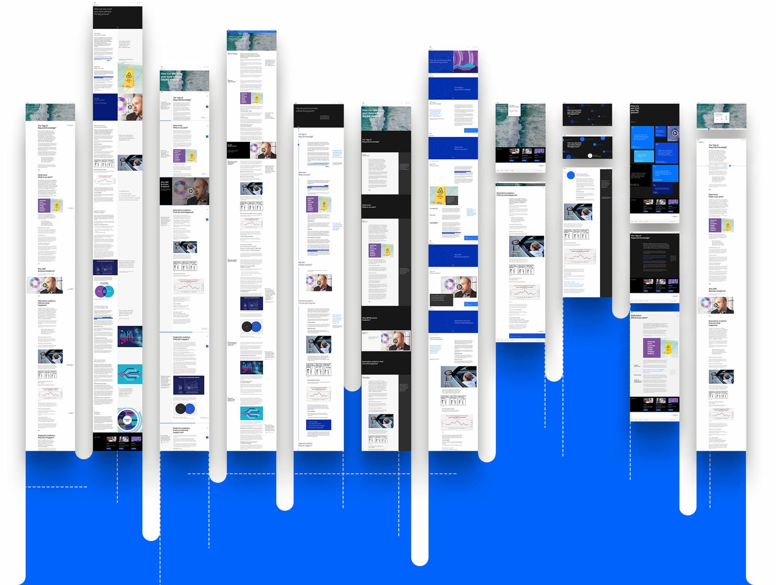
Ten models were fully designed, with special attention to IA and microinteractions. We held weekly workshops with stakeholders to curate every experience and make sure they adhered to the brand’s principles and guidelines.
While the content across all models was the same, the components had to be adjusted for each experience and unique interactions identified and documented.
The solution is inspired by kinesthetic learning. Even though other senses can be triggered by the interactive installations, touch is the dominant one and it creates a personal connection between the individual and the content.
The symbol stems from the letter “t” in braille system, and is slightly stylized to provide visual balance; it can be quickly recreated following the grid provided.
PROTOTYPING
PROTOTYPING
After several refinement and optimization sessions we got clearance to move all ten experiences to the prototyping and testing phases.
The collaboration with IBMs team on this project allowed us to move faster through the design stage and really focus on the interaction patterns and usability of the experiences.
The solution is inspired by kinesthetic learning. Even though other senses can be triggered by the interactive installations, touch is the dominant one and it creates a personal connection between the individual and the content.
The symbol stems from the letter “t” in braille system, and is slightly stylized to provide visual balance; it can be quickly recreated following the grid provided.
USER TESTING
USER TESTING
USER TESTING
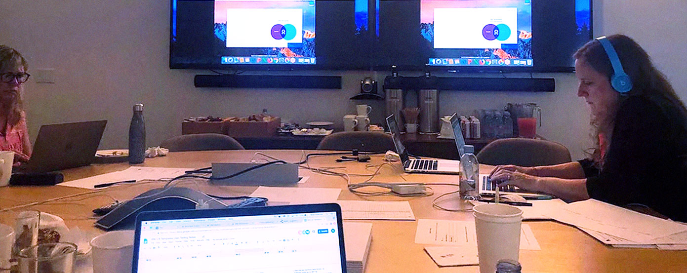
To evaluate the best performing models, we defined a testing flow outlining general tasks as well as pointed questions specific to each interaction model.
We conducted 20 sessions of moderated study; participants were asked to interact with a number of models for 5 minutes, then complete the list of tasks for another 10 minutes. During the remaining 10-15 minutes users were further probed on their understanding of the navigation of the page and asked follow up questions on which elements were the most useful/relevant to them.
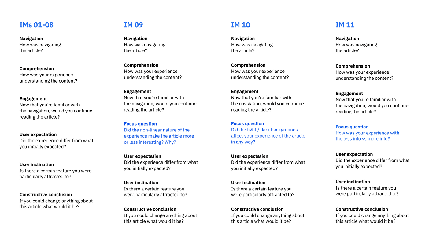
Success rate was measured against the following metrics:
Comprehension
After the first couple of minutes does the user understand the general topic of the white paper?
Navigation
Is the experience enjoyable and is the navigation intuitive?
Engagement
Does the user feel motivated to read through to the end of the white paper?
RECURRING THEMES
RECURRING THEMES
We grouped the feedback in three categories that mapped to the previously defined success metrics. The overlapping responses outlined the users’ preferences and favorite interactions; having a reading time indicator and a clear text hierarchy were among the most desired ones.
Given the nature of whitepapers pritable layouts were also an unexpected feature that most users were looking for when evaluating the different models.
XD/Navigation
Section overview/menu
Reading time
No long scroll
Numbered sections
Microinteractions
Visual design
Pull quotes
Blue for links
Fewer font sizes
Visual design
Pull quotes
Blue for links
Fewer font sizes
Content/Layout
Consistent text justification
Printable layouts
Content/Layout
Consistent text justification
Printable layouts
Content/Layout
Consistent text justification
Printable layouts
Along with the preferred features and experiences we also got insight into which models performed poorly and why. This was of great value to understand user behavior and level of comfort when reading long articles, and helped us improve further the five experiences selected to be developed.
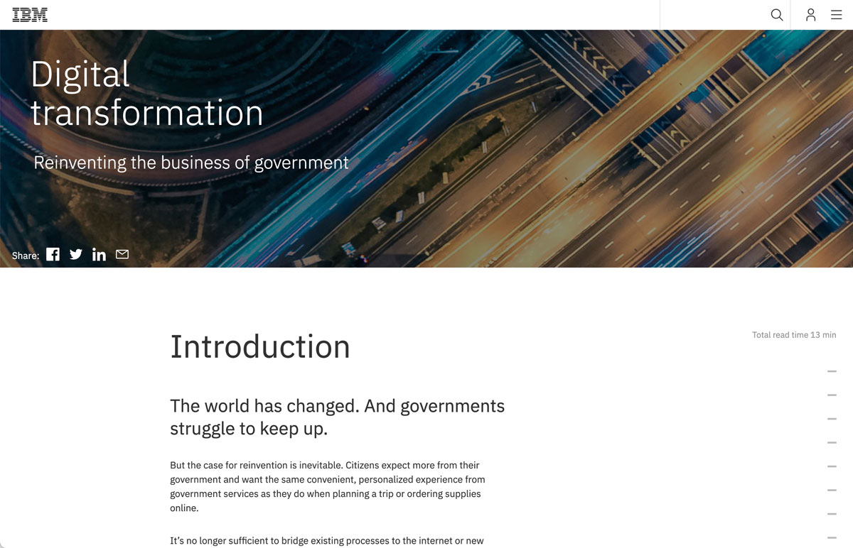
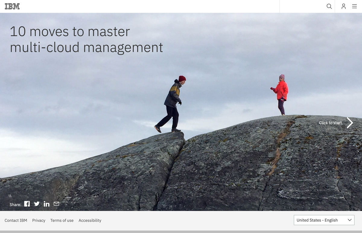
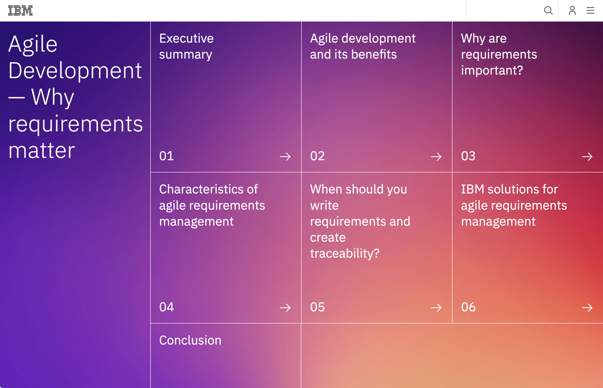
Find below a breakdown of the final interaction models as well as links to some of the interactive whitepapers.
CONCLUSION
The five interaction models were distributed among IBMs business units and tested with BU specific content. The component library and flexible CMS made it easy for the editors to quickly build whitepapers but also allowed them to personalize the templates further by integrating third party APIs and custom code.
Although the models were a big improvement from the former static pdf whitepapers, this project represented a small step towards creating a larger managing system or hub where these whitepapers could be stored and catalogued for ease of search and cross-reference.
Another future consideration was to include an animation library and add new styling options that would expand the templates' customization capabilities making for a more robust tool.
Thank you!