
Client: TD Ameritrade
Client: TD Ameritrade
Client: TD Ameritrade
Client: TD Ameritrade
Online Application Prototypes
Online Application Prototypes
Online Application Prototypes
Online Application Prototypes
Online Application Prototypes
Role: Project lead, Product design, Animation
Role: Project lead, Product design, Animation
Role: Project lead, Product design, Animation
Role: Project lead, UX/UI, Animation
TD Ameritrade's outdated application forms were the main reason for high drop-off rates, with the majority of users abandoning after the first step.
This project explored how to create an appealing and intuitive design, able to convert prospects to clients in the most optimal way possible.
TD Ameritrade's outdated application forms were the main reason for high drop-off rates, with the majority of users abandoning after the first step.
This project explored how to create an appealing and intuitive design, able to convert prospects to clients in the most optimal way possible.
TD Ameritrade's outdated application forms were the main reason for high drop-off rates, with the majority of users abandoning after the first step.
This project explored how to create an appealing and intuitive design, able to convert prospects to clients in the most optimal way possible.
TD Ameritrade's outdated application forms were the main reason for high drop-off rates, with the majority of users abandoning after the first step.
This project explored how to create an appealing and intuitive design, able to convert prospects to clients in the most optimal way possible.
PROBLEM
The current online application form (OLA) has approximately a 77% drop-off, with most users abandoning the flow after Step 1 (72%). The form took much longer to complete than promised and having to provide sensitive information without explaining why created high levels of frustration.
The OLA is the key driver of Net New Assets, TD Ameritrade’s most important success metric, so it was a priority to provide insight on the most effective way to design and restructure their Online Application forms.
The current online application form (OLA) has approximately a 77% drop-off, with most users abandoning the flow after Step 1 (72%). The form took much longer to complete than promised and having to provide sensitive information without explaining why created high levels of frustration.
The OLA is the key driver of Net New Assets, TD Ameritrade’s most important success metric, so it was a priority to provide insight on the most effective way to design and restructure their Online Application forms.


Objective — Clearly displaying reasons for asking information as the user moves along the form shows transparency and increases trustworthiness in the company. This is especially helpful to those newer to investing.
Objective — Clearly displaying reasons for asking information as the user moves along the form shows transparency and increases trustworthiness in the company. This is especially helpful to those newer to investing.
Objective — Clearly displaying reasons for asking information as the user moves along the form shows transparency and increases trustworthiness of the company. This is especially helpful to those newer to investing.
Objective — Clearly displaying reasons for asking information as the user moves along the form shows transparency and increases trustworthiness in the company. This is especially helpful to those newer to investing.
Clearly displaying reasons for asking information as the user moves along the form shows transparency, increases trustworthiness of the company. This is especially helpful to those newer to investing.
APPROACH & USER FLOWS
APPROACH & USER FLOWS
APPROACH & USER FLOWS
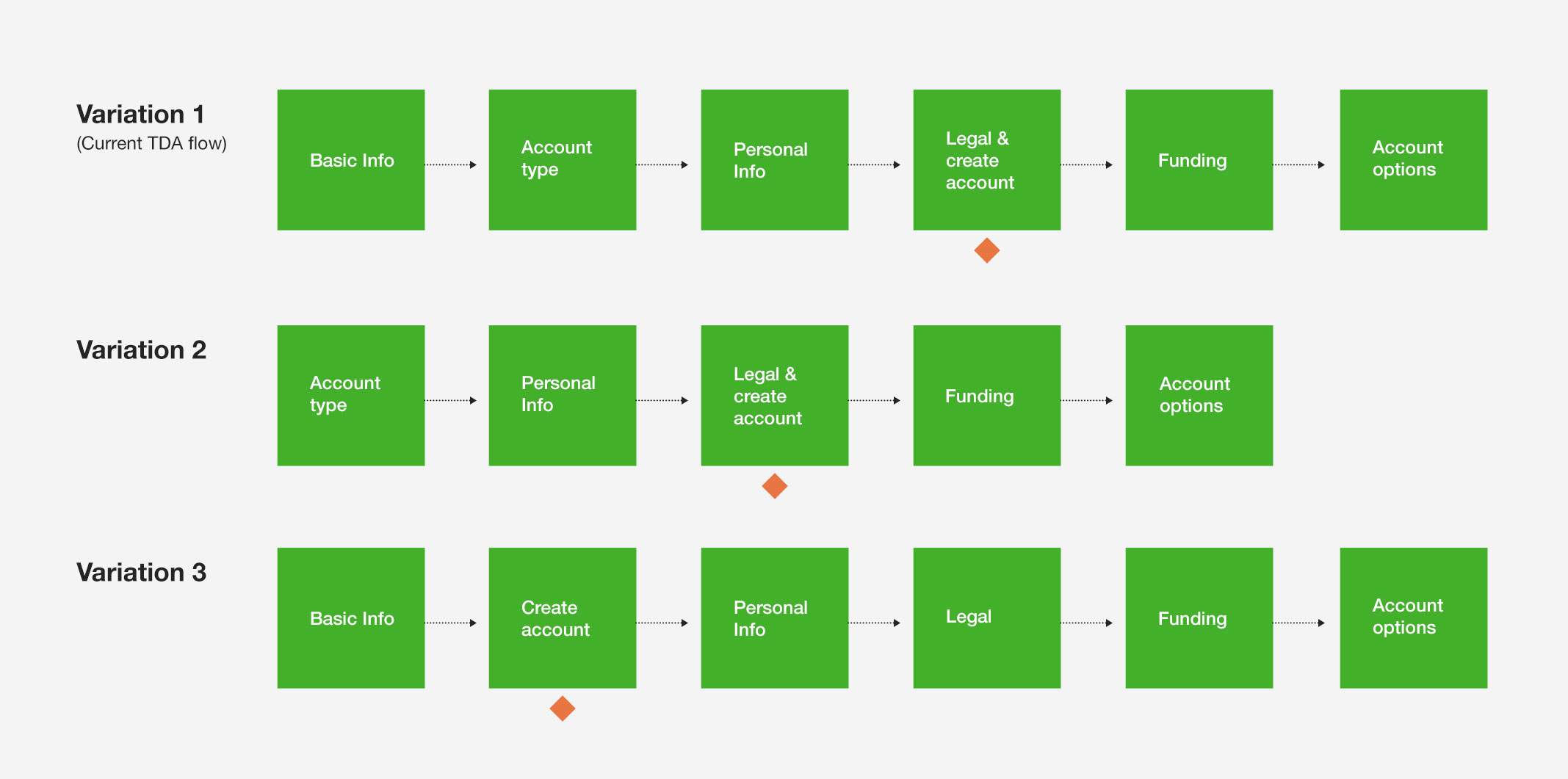
We tested two interactive prototypes to explore our design hypotheses.
Hypothesis 1: Simplified minimal design will increase sign-up completion rate.
- Variation 1: Standard flow with minimal changes to question order and omission of optional questions
- Variation 2: Start with account type selection (express track brokerage)
- Variation 3: Start with account registration creation first (save and resume)
Hypothesis 2: Conversational design will increase sign-up completion rate.
UI KIT
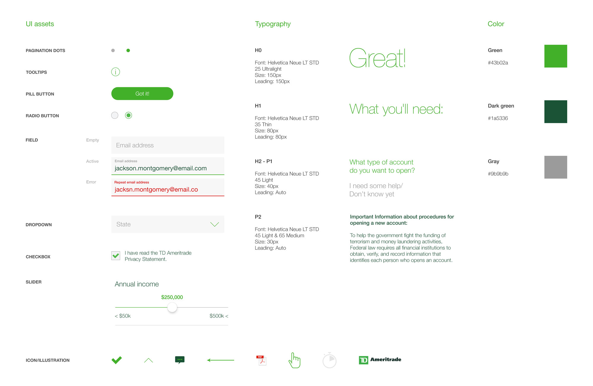
Based on TDA's brand assets we created a basic UI kit with all the components, new and existing, required for each of the experiences.
The solution is inspired by kinesthetic learning. Even though other senses can be triggered by the interactive installations, touch is the dominant one and it creates a personal connection between the individual and the content.
The symbol stems from the letter “t” in braille system, and is slightly stylized to provide visual balance; it can be quickly recreated following the grid provided.
H01 / VARIATION 01
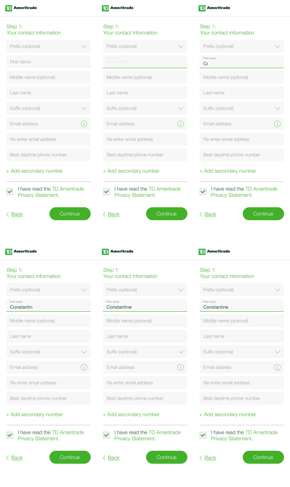
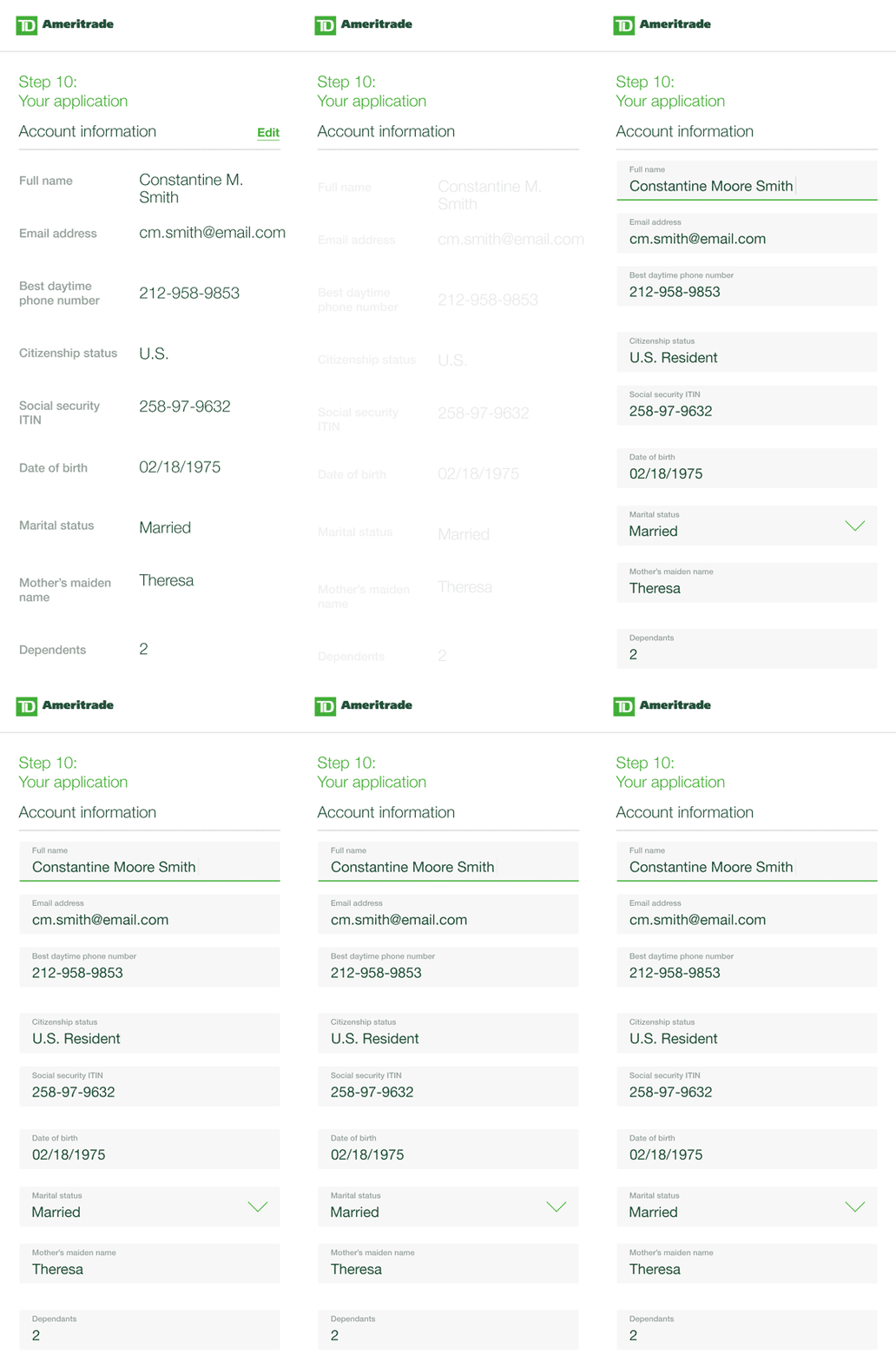
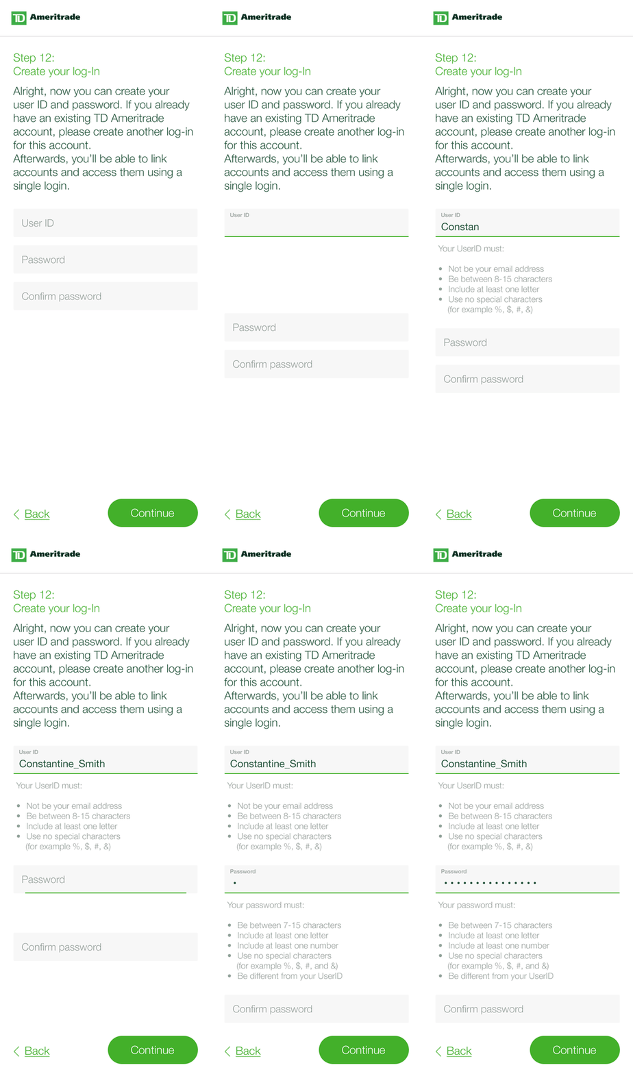
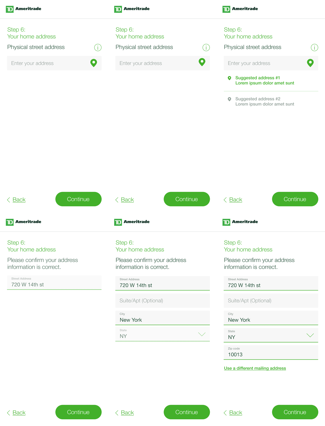
The first iteration was aimed at cleaning up the design and defining a clear content hierarchy. We leveraged the existing flow but reduce the clutter and broke off the steps in digestible bits to increase the focus on tasks.
The UX provided contextual help where needed (tooltips) and purposeful animations made it easier for the user to navigate the application forms and better understand the task at hand.
Improvements over the old flow:
- Binary choice on single screen
- Animated input fields (success, error, edit)
- Takeover info screen for tooltips
- Enable location for address input
- Progressive reveal of fields after selection
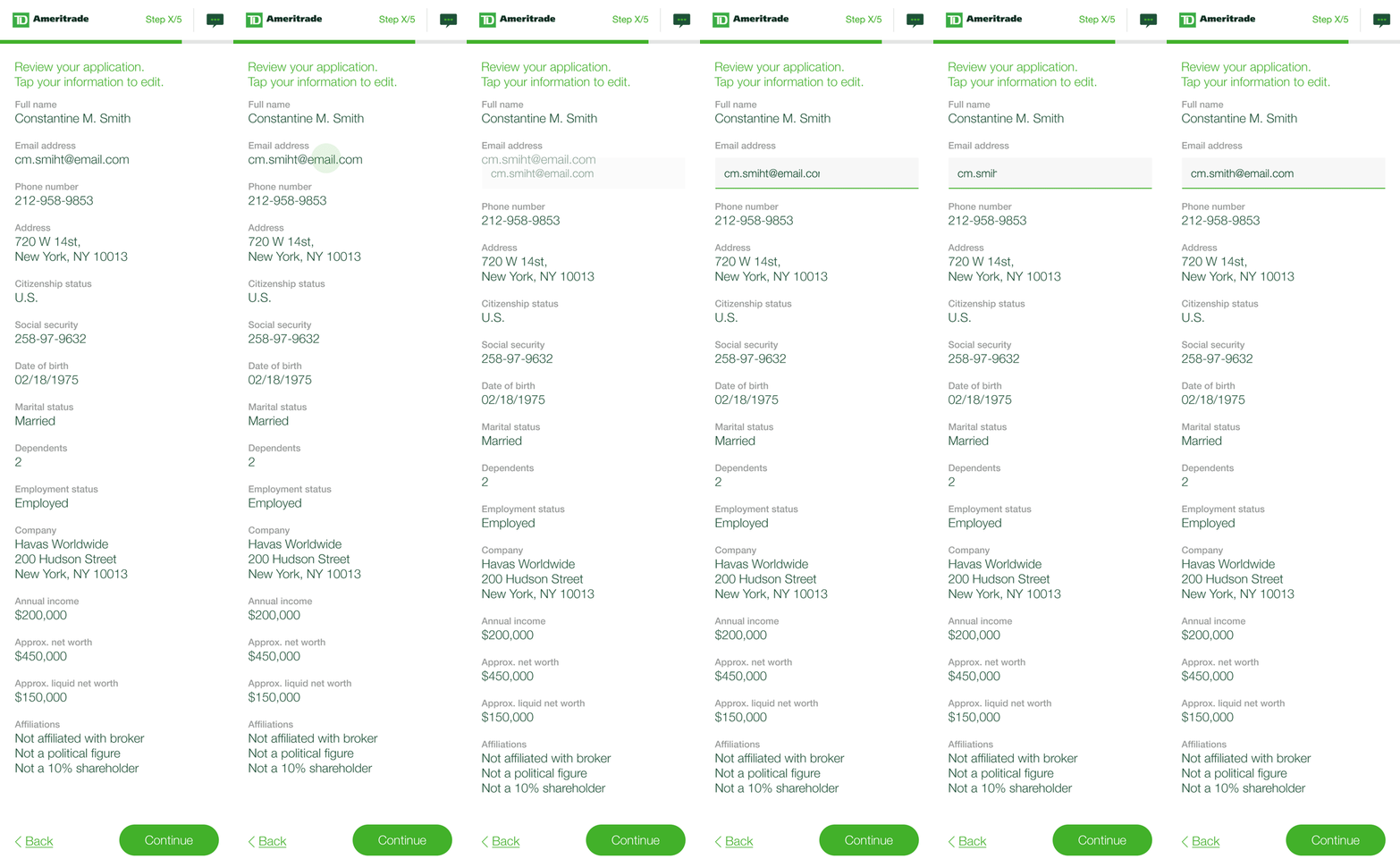
- Live editing features




H01 / VARIATION 02
H01 / VARIATION 02
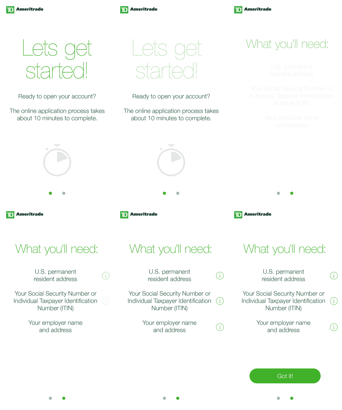
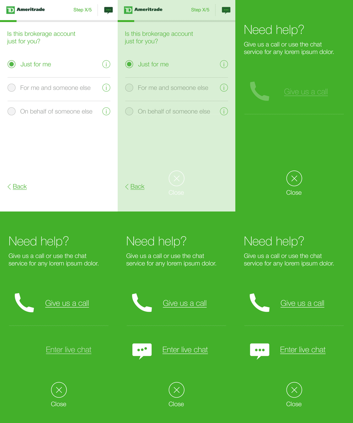
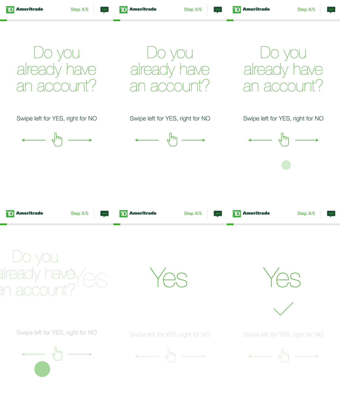
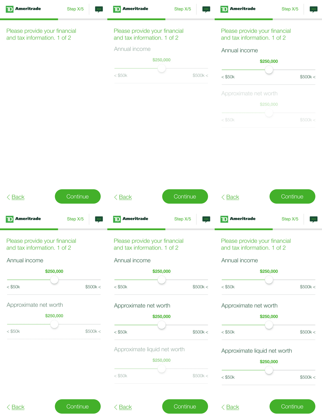
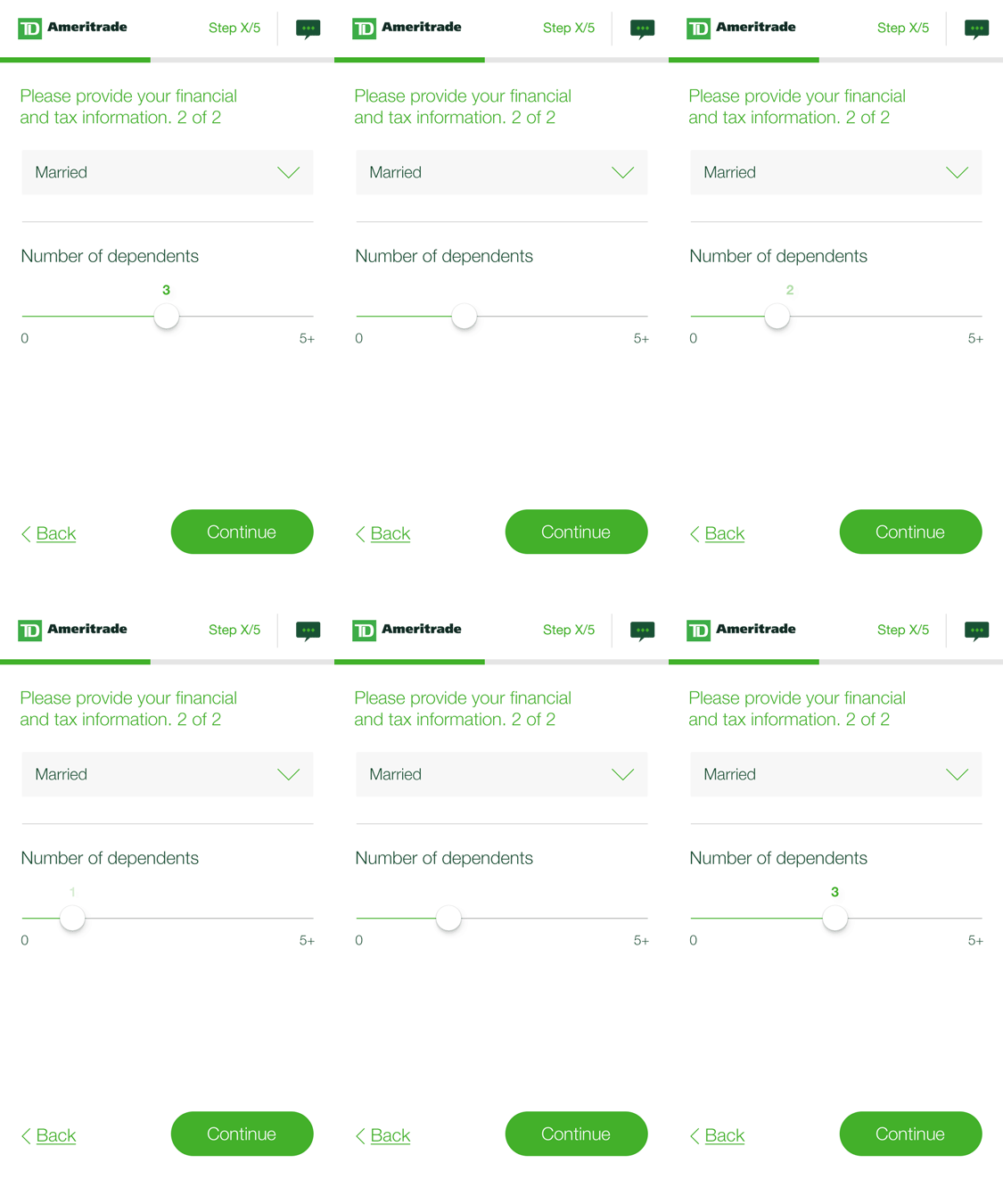
For this version we leaned into swipe gestures to answer binary questions or navigate through pagination. We also included a persistent help button for general assistance in the nav bar as well as a progress bar to indicate estimated completion time.
Variation 02 specific improvements:
- Swipe gesture
- Progress bar & # of steps
- Help button
- Sliders for quantities (income, net worth, number of dependants,...)
- Option to call or chat (help button)
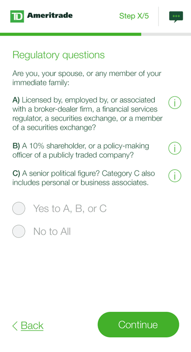
- Grouped answers (yes/no to all)
For this version we leaned into swipe gestures to answer binary questions or navigate through pagination. We also included a persistent help button for general assistance in the nav bar as well as a progress bar to indicate estimated completion time.
Variation 02 specific improvements:
- Swipe gesture
- Progress bar & # of steps
- Help button
- Sliders for quantities (income, net worth, # of dependants, etc)
- Option to call or chat (help button)
- Grouped answers (yes/no to all)

H01 / VARIATION 03
H01 / VARIATION 03
H01 / VARIATION 03
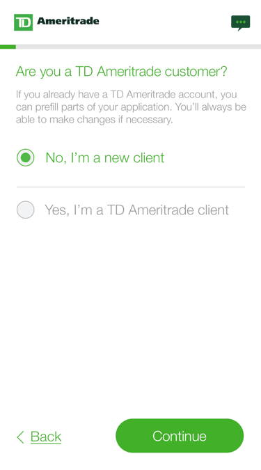
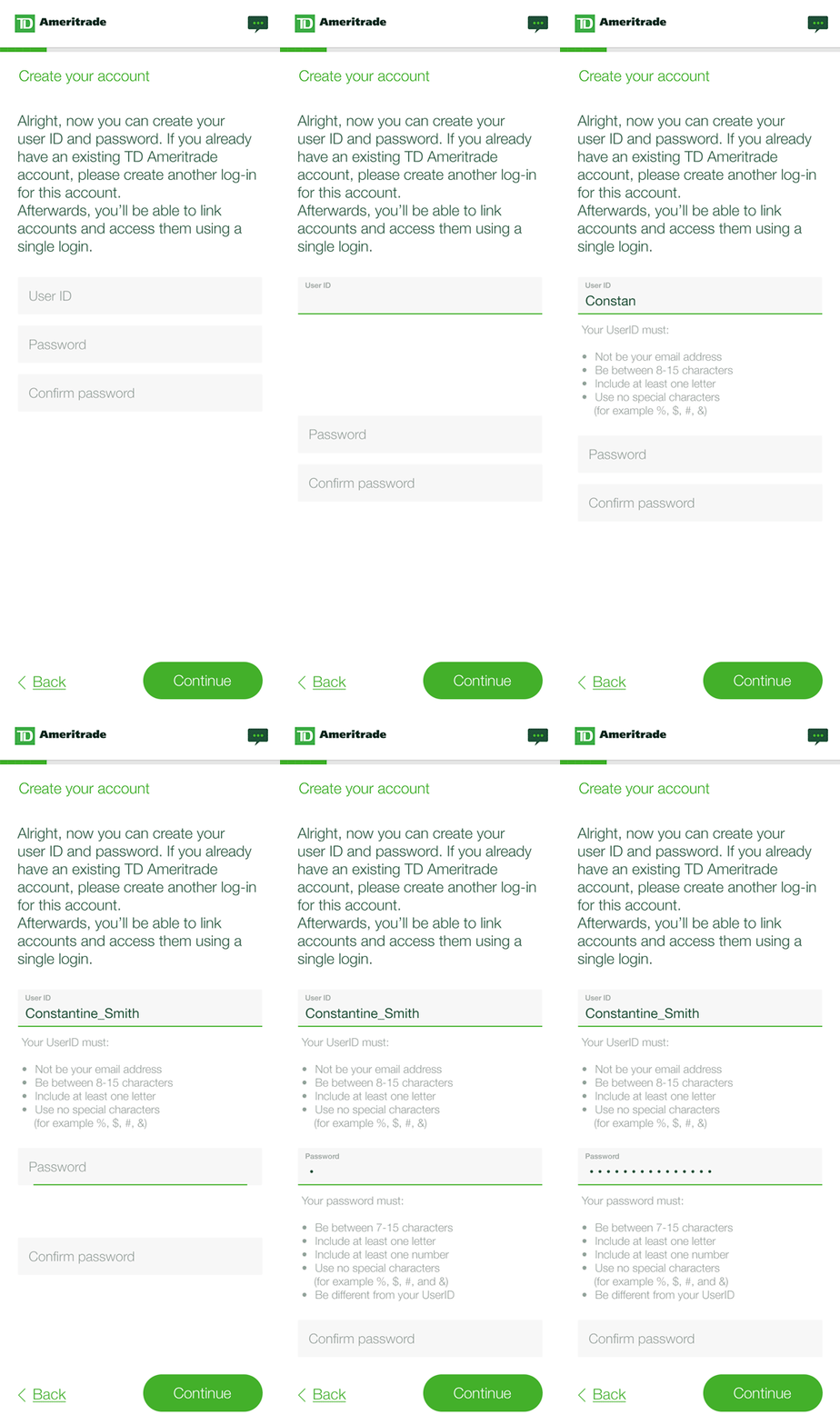
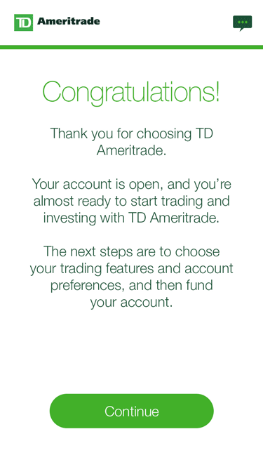
The third iteration included most elements from the second one with the addition of a "Save and finish later" functionality that allowed users to interrupt the application without losing any information.
In order to better compare against the other two iterations this experience required the user to create an account before inputting any information as the main variable.
The third iteration included most elements from the second one with the addition of a "Save and finish later" functionality that allowed users to interrupt the application without losing any information.
In order to better compare against the other two iterations this experience required the user to create an account before inputting any information as the main variable.

HYPOTHESIS 02
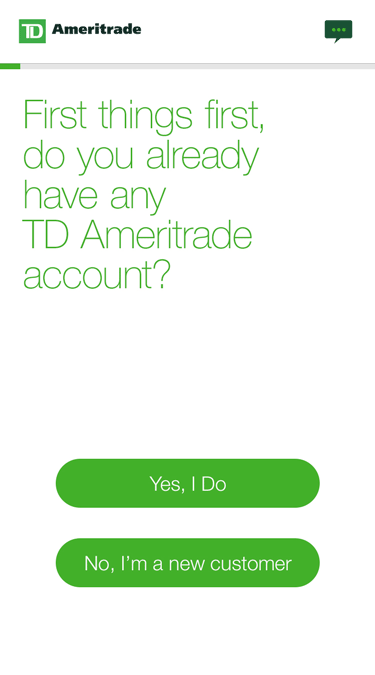
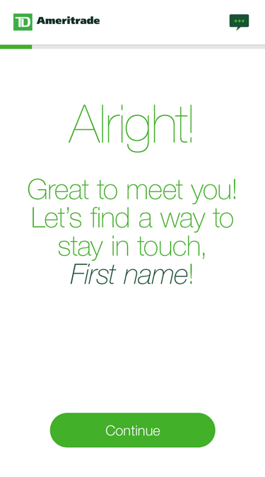
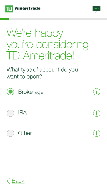
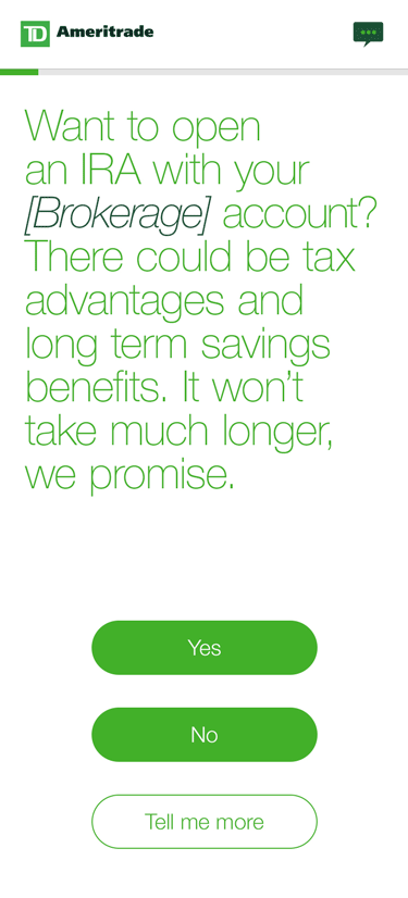
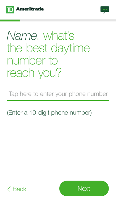
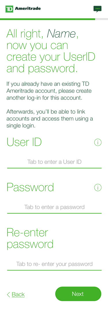
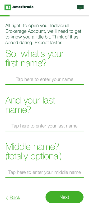
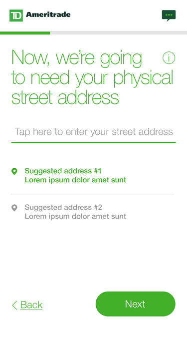
The last model delivered a conversational, more informal voice that implemented users' answers through dynamic fields, providing a more personalized experience.
The information was broken down into smaller sets of questions to keep the focus of the participants and make it more agile. While the completion of this flow took a bit longer, the hypothesis was that bigger type size, focused questions, and simple interactions would keep a higher engagement factor.
The last model delivered a conversational, more informal voice that "remembered" users answers through dynamic fields providing a more personalized experience.
The information was broken down into smaller sets of questions to keep the focus of the participants and make it more agile. While the completion of this flow took a bit longer, the hypothesis was that bigger type size, focused questions, and simple interactions would keep a higher engagement factor.
The last model delivered a conversational, more informal voice that "remembered" users answers through dynamic fields providing a more personalized experience.
The information was broken down into smaller sets of questions to keep the focus of the participants and make it more agile. While the completion of this flow took a bit longer, the hypothesis was that bigger type size, focused questions, and simple interactions would keep a higher engagement factor.




RESULTS & TAKEAWAYS
We conducted 29 sessions with the 4 prototypes, plus a baseline version.
Prototypes were tested in both desktop and mobile format, and each test session was conducted one-on-one, for approximately 60 minutes; all were conducted remotely (across the US).
Some participants saw two prototypes if time allowed. In each of these cases, the baseline was one of the two stimuli presented. At the conclusion of the first prototype or baseline, all participants were given a short survey. Video and audio recordings were made of each session.
Overall, we obtained very positive feedback across the four new design concepts.
New design elements were well received:
- How username/password are validated (baseline version)
- Large/easy to read fonts and targets (new design concepts)
- The ability to save/continue (new design concepts)
- The ability to chat with a representative (new design concepts).
There was a mixed reaction to the informal tone used in H02 (new design concepts). Some participants appreciated the less formal tone, other participants thought it didn't feel professional.
Most participants who were asked about opening a second account expressed that they would be interesting in doing so, and would expect their information from the first account to carry over into any subsequent accounts.
Overall, we obtained very positive feedback across the four new design concepts.
New design elements were well received:
- How username/password are validated (baseline version)
- Large/easy to read fonts and targets (new design concepts)
- The ability to save/continue (new design concepts)
- The ability to chat with a representative (new design concepts).
There was a mixed reaction to the informal tone used in H02 (new design concepts). Some participants appreciated the less formal tone, other participants thought it didn't feel professional.
Most participants who were asked about opening a second account expressed that they would be interesting in doing so, and would expect their information from the first account to carry over into any subsequent accounts.
Participants “felt more confident” using the improved baseline (variation 01), and attributed their confidence to the site looking more “sophisticated” and “streamlined.”
- More user-friendly
- User ID and password real-time validation
- Seems like it would be faster to get through
- Better design (layout, visual components, information display)
- More informative
Participants “felt more confident” using the improved baseline (variation 01), and attributed their confidence to the site looking more “sophisticated” and “streamlined.”
- More user-friendly
- User ID and password real-time validation
- Seems like it would be faster to get through
- Better design (layout, visual components, information display)
- More informative
Other takeaways:
- Minimal amount of information on screen made the content more digestible (i.e. minimal scrolling)
- Better design (large click targets/font, cleaner looking, less clicks, more modern)
- Participants pointed out that once the new design screens started getting longer (needing to scroll) it became “annoying”
*Note: personalization or language/tone were not explicitly referenced nor inferred as to reasons why new design concepts were preferred.
Other takeaways:
- Minimal amount of information on screen made the content more digestible (i.e. minimal scrolling)
- Better design (large click targets/font, cleaner looking, less clicks, more modern)
- Participants pointed out that once the new design screens started getting longer (needing to scroll) it became “annoying”
*Note: personalization or language/tone were not explicitly referenced nor inferred as to reasons why new design concepts were preferred.
Other takeaways:
- Minimal amount of information on screen made the content more digestible (i.e. minimal scrolling)
- Better design (large click targets/font, cleaner looking, less clicks, more modern)
- Participants pointed out that once the new design screens started getting longer (needing to scroll) it became “annoying”
*Note: personalization or language/tone were not explicitly referenced nor inferred as to reasons why new design concepts were preferred.
—“Visually, this site is a lot more attractive. It actually looks like I could be on the main website right now.”
—“Visually, this site is a lot more attractive. It actually looks like I could be on the main website right now.”
—“Visually, this site is a lot more attractive. It actually looks like I could be on the main website right now.”
—“Visually, this site is a lot more attractive. It actually looks like I could be on the main website right now.”
—“Visually, this site is a lot more attractive. It actually looks like I could be on the main website right now.”
—“I really like the look of the new design concept more… it was more like a mobile app. Seems like it would be faster to get through”.
—“I really like the look of the new design concept more… it was more like a mobile app. Seems like it would be faster to get through”.
—“I really like the look of the new design concept more… it was more like a mobile app. Seems like it would be faster to get through”.
—“I really like the look of the new design concept more… it was more like a mobile app. Seems like it would be faster to get through”.
—“I like that I didn’t have to put in any information at all to get all this”.
—“I like that I didn’t have to put in any information at all to get all this”
—“I like that I didn’t have to put in any information at all to get all this”.
—“I like that I didn’t have to put in any information at all to get all this”.
—“I like that I didn’t have to put in any information at all to get all this”.
CONCLUSION
All four variations and our usability report highlighted TDA's online application challenges and laid out ways to significantly improve the experience by implementing the IA and features explored in this project.
Our findings provided the foundation for future iterations of the OLA and had a direct impact on both the language and the UX/UI design of the sign up process.
All four variations and our usability report highlighted TDA's online application challenges and laid out ways to significantly improve the experience by implementing the IA and features explored in this project.
Our findings provided the foundation for future iterations of the OLA and had a direct impact on both the language and the UX/UI design of the sign up process.
Thank you!
